Looking Ahead to 2017

Although 2016 may not have been the worst year, a lot of people were nevertheless happy to see it end last week.  But for Pens and Junk, at least, the year was pretty good. I’ve been able to keep up with posting at a weekly pace, and all said and done, average monthly views jumped from 1,650 in 2015 to 4,345 in 2016. Not too bad, I think.
new-year-2017-png-12

Over the last year, I’ve written more than 30 pen reviews. Some of these pens have been good and some have been bad, but the most popular review on the blog, as well as my 2016 Pen of the Year, was undoubtedly the Grafton by Everyman.  It’s one of the very few pens I’ve actually run dry.

The overall most popular post of 2016, however, was my review for Aaron Draplin’s book, Pretty Much Everything. Though, I’m also happy to have read and written reviews for Paper by Mark Kurlansky and The History and Uncertain Future of Handwriting by Anne Trubek. I plan on writing at least a couple more book reviews this upcoming year, so if you have any suggestions, drop me a line.
img_6108

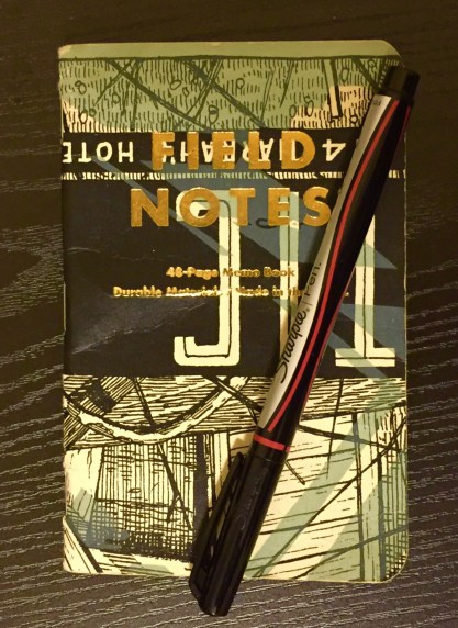
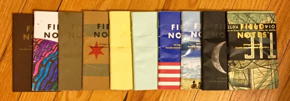
In 2017, you can also expect more posts about Field Notes and Retro 51 Tornado pens – I haven’t grown tired of collecting either. Baron Fig also launched their own quarterly subscription service for their popular Squire pen, which I bought. It was a bit expensive, and I don’t know what to expect. But I guess we’ll find out together.

Additionally, more Kickstarter pens should be arriving on my doorstep this year, including the TriTac and the SQ1. And though it’s not exactly stationery related, I even backed The Fidget Cube, which I may write about here.

Oh, and I have to write the final three parts to my Nib Novice series. I’ve had a blast with it, and I’ve really learned a lot. Afterwards, you may see increased posting about fountain pens and inks.

img_6109

As for non-pen/stationery/blog stuff to look forward to in 2017. Uh… obviously, Star Wars Ep. 8. Although Logan and Spider-Man: Homecoming look pretty awesome too. And, once again, I’m excited about Game of Thrones coming back on air this summer for the penultimate season (which is good since George R.R. Martin will probably never finish writing the book series). I also am looking forward to a new season of Curb Your Enthusiasm, which is back after a six-year break. And, if I’m lucky, I might finally be able to get my hands on an NES Classic.

Overall, I think a lot of awesome stuff will happen in 2017, and I hope it makes for a wonderful year for everybody.

Notes on Dead Print Field Notes

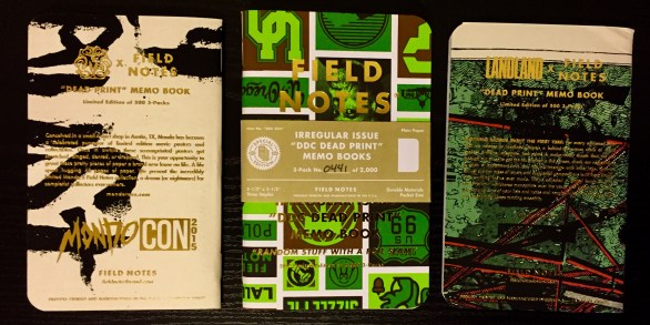
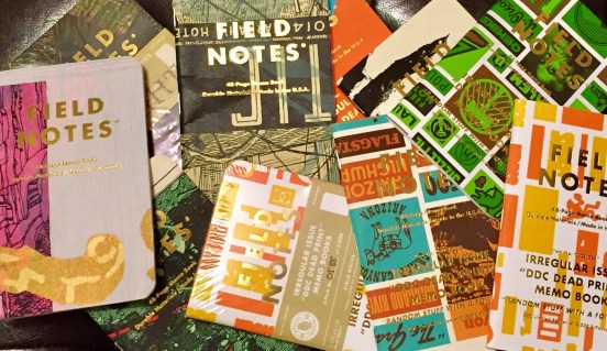
“Posters are delicate things,” writes Aaron Draplin. So what is a poster-maker to do when misprinted, damaged, and test prints begin to pile up in the workshop? For Draplin, the creator of Field Notes, the answer couldn’t have been too difficult: use these ‘dead prints’ to make pocket-sized memo books.

img_6026

So, in October of 2015, limited edition “Dead Print Field Notes” were made for three poster-producing companies: Draplin Design Co., Mondo, and Landland. Between all three companies, only 3,000 3-packs were made, and with images of these notebooks sporadically popping up on Instagram and Twitter, these Dead Print Field Notes became somewhat of a craze.

Although the notebooks contain basic 50# blank paper, the unique covers, made from assorted posters, spurred on the collectors. Getting my hands on all three was no easy task. I’ve seen sealed 3-packs occasionally sell for over a hundred dollars on eBay (much, much more than I’m willing to spend), but with a bit of patience, I found them all individually for reasonable prices.

img_6023

The DDC Dead Prints were initially only sold at a pop-up shop run by Aaron Draplin in Portland, but eventually a handful were sold through his website. There I was able to grab a couple 3-packs before they sold out. Similarly, the LandLand Dead Prints were briefly available on their website, but many of the shipments were lost in the mail, including mine. Fortunately,  the good folks at LandLand were able to ship out replacements a couple months later.

The Mondo Dead Prints were trickier. They were initially distributed only at MondoCon, the company’s convention, but some extras were sold online. These became sold out lightning-fast, well before I was able to add a pack to the shopping cart. But, after months of scouring eBay, I eventually found a single Mondo notebook for a relatively low price (never mind that it’s mostly just a white notebook).

img_6024

After some use, I wouldn’t hesitate to say that these Dead Print Field Notes are one of my favorite editions. Aside from the special cover-paper, there’s no difference between this and a standard Field Notes notebook. However, with their wild designs and the gold-foil used for the cover text, I’ve received more comments/compliments on these notebooks than I have while carrying around any other Field Notes edition. It’s really a shame that these notebooks are so rare, but maybe, if we’re lucky, Draplin, LandLand, and Mondo will continue to damage enough posters in order to justify another run.

Additional Notes

  • The Mondo Dead Prints have no “Practical Applications” list, but a musician/artist roster for their convention instead. Both the DDC and Landland books, however, do have “Practical Applications” lists. My favorites: “02. Thick Lines Tinkerings” (DDC) and “16. Hashtag Plans” (LandLand).
  • Even the belly-bands seem to be made of inside-out posters.
  • And speaking of Aaron Draplin, I wrote a review of his book. I liked it. It’s worth checking out if you like those DDC Dead Print designs.

Retro Talk: A Tribute to Gray’s Anatomy

img_5936

When I was in college I bought myself a copy of Gray’s Anatomy – not to be confused with Grey’s Anatomy, the TV show – edited in the form of a coffee table book. At the time I didn’t own a coffee table, but I really liked the anatomical drawings. The illustrations are something almost anyone can appreciate, as they are an amazing example of functional art. Each drawing takes attention to detail and a lot of study.

So, when Retro 51 released a Tornado design earlier this year named Dr. Gray, I didn’t wait long to place my order. The barrel features an anatomical drawing of the skeletal system with 30+ of the major bones identified. I’m not sure whether this illustration is a Gray’s Anatomy original or if it has been redrawn by another artist, but, either way, it would be good enough for at least a couple of correct answers on a biology exam.

graysanatomybook

Like the Albert Tornado, this design is part of Retro 51’s “Vintage Metalsmith” series, which mainly means that the metal on the clip, twist, and tip has been weathered. One fairly unique feature, however, is that the Dr. Gray glows in the dark after being exposed to light. Since I usually keep pens in my pocket (and I don’t use them in the dark), it took me a while to notice. Throw it directly under a bright bulb for 10 minutes, however, and it glows quite brightly. It’s a neat little gimmick that gives it a Halloween vibe.

I like the Dr. Gray, although, at $40, it’s more expensive than many other Retro 51 Tornado designs. But if you know an orthopedist or a med student, it would probably make a really cool gift.

img_5939

Notes on Lunacy Field Notes

Lunacy, Field Notes’ Fall 2016 Special Edition, is what you get when you take a simple concept and go a little crazy on the execution.

img_5608

Its theme pays homage to Earth’s celestial buddy, the moon, and there’s a lot more than usual going on with these little 3.5″ x 5.5″ pocket notebooks. They contain 60# light gray notebook paper with a reticle grid ruling. They are bound together with black staples that blend into a shimmery, black cover stock, giving it an almost leather-like look. And along with the the embossed Field Notes logo on the front, you’ll find a black moon logo embossed on the back cover.

But, of course, the most noteworthy aspect of the Lunacy edition is their die-cut covers, which open like little windows into a glossy inner photo of the moon.  Each book in the set is cut to represent a different phase of the moon: there’s a waning crescent, a third-quarter (half) moon, and a full-moon. Those who are subscribers to Field Notes’ quarterly additions also received a bonus “new moon” book, which just has a fully-intact black cover.

img_5893

The glossy inner cover-pages aren’t just for show either, they also include a bunch extra info. In typical Field Notes fashion, some of this information is lightly useful, but most of it is just for fun. Need to know how to say “moon” in German? This notebook has got you covered. Want to know how to kill a werewolf? You’ll have that info in your back pocket too.

It’s a cool edition overall, though I’m not a huge fan of the die-cut covers. While they don’t rip or tear like I initially thought they would, I still find them a little annoying. But beyond that, these books remind me a lot of Field Notes’ Night Sky edition from the summer of 2014. That’s an edition I’ve always wanted to own, but they are now sold out (and much too expensive to buy through eBay). Lunacy, as well, is a little more expensive than usual – $12.95 for a 3-pack – but still worth it for any aspiring astronaut.

img_5894

Additional Notes

  • Of the 30 “Practical Applications” listed in the notebooks’ inside-back cover, my favorites are the following: “2. ‘That’s No Moon'”; “20. Dark Side Theories”; and “22. Tidal Changes.”
  • Check out  Ed Jelly’s review for lots of good pictures, and Fountain Pen Follies says that these notebooks are very fountain pen friendly.
  • Definitely check out the video that Field Notes produced for this edition. It’s almost as if they were trying to fake the moon landing.

Retro Talk: The Birthday Tornado

img_5797

Take a look through any Retro 51 collection, and you’re bound to find a lot of really amazing designs. And though a simple classic lacquer Tornado costs only about $20, you’ll have to shell out around $25 to $50 for a special or limited edition Tornado or sometimes upwards of $100 for a Tornado design that’s discontinued or currently out of production. There is, however, one exception that I know of: the Retro 51 ‘Birthday Greetings’ Tornado series.

At one point in time, Retro 51 was making a bunch of these ‘Greeting Series’ pens. There’s the ‘Happy Holidays’ Tornado, the ‘Congrats’ Tornado, and even the simple ‘Thanks’ Tornado, but these days they are all pretty difficult to find for a reasonable price. But for whatever reason, the ‘Happy Birthday’ Tornado can easily be found for under 15 dollars.

retro-51-birthdayblue

The ‘Birthday Greeting’ series was made with three different colors/designs: blue (shown above), yellow (shown below), and red (shown here). Apart from the colors, the red and yellow pens are identical. They have phrases and icons pictured all over the barrel, and the word “BIRTHDAY!” is splashed across the side. The blue version is subtler, and it mainly consists of numbers/ages. The blue design still contains an assortment of birthday-ish words and icons, but you’d really need to examine it in order to see the theme.

Perhaps it feels like you can only use this pen one day a year, but I actually use mine all the time (I bought the blue version for myself last year). It’s also a nice and easy present. In fact, I just gave away the yellow version as a gift, and I might just stockpile the red version to give away sometime next year. And as an unskilled gift wrapper, I always appreciate when a product comes in its own gift box.

retro51-birthday-yellow