Retro Talk: Stealthy Terabyte 2.0

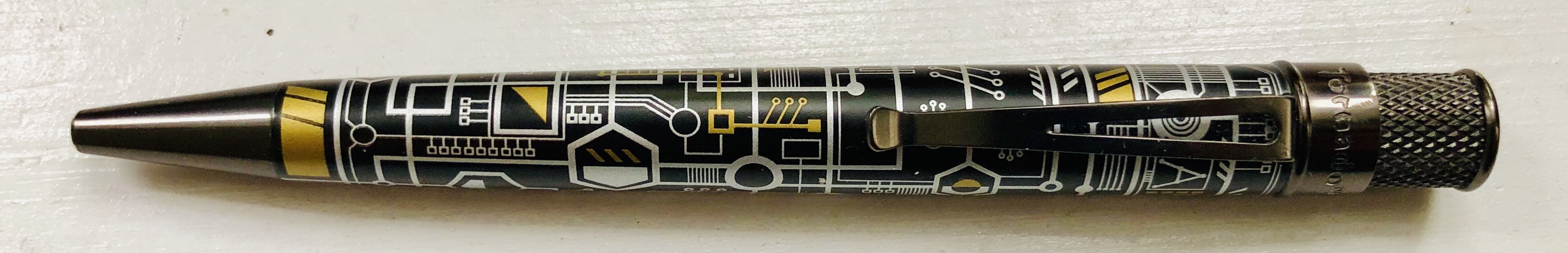
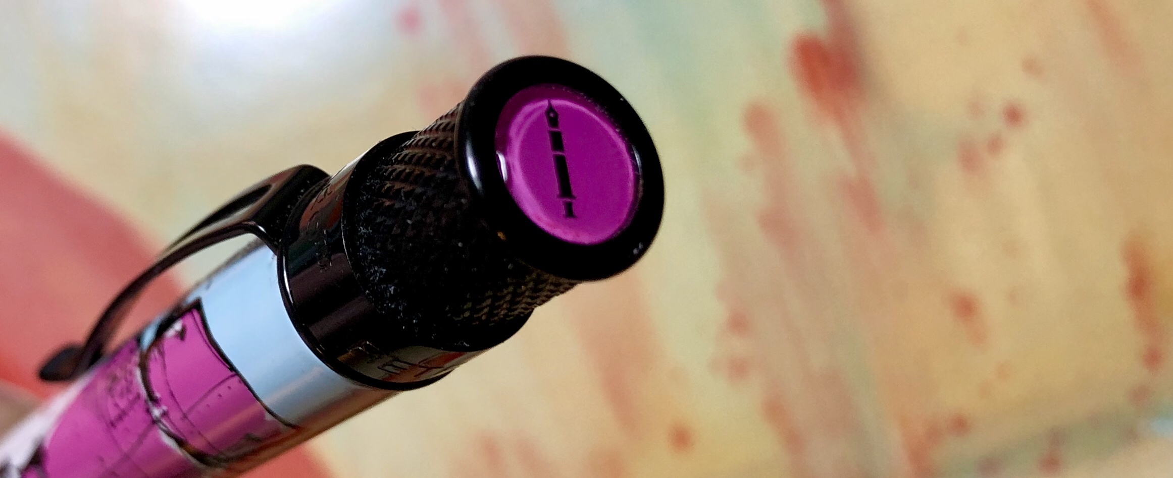
Back in 2015, Retro 51 and Anderson Pens released the original Terabyte Tornado as a limited edition of 500. I loved the design, and, having assumed it would be a hot item, I pre-ordered one immediately. It turns out that it actually took a couple of years to move all those pens, but it was apparently still successful enough to launch a follow up: The Terabyte 2.0

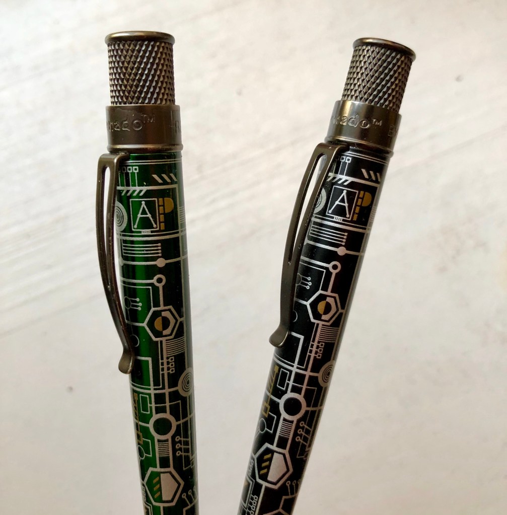
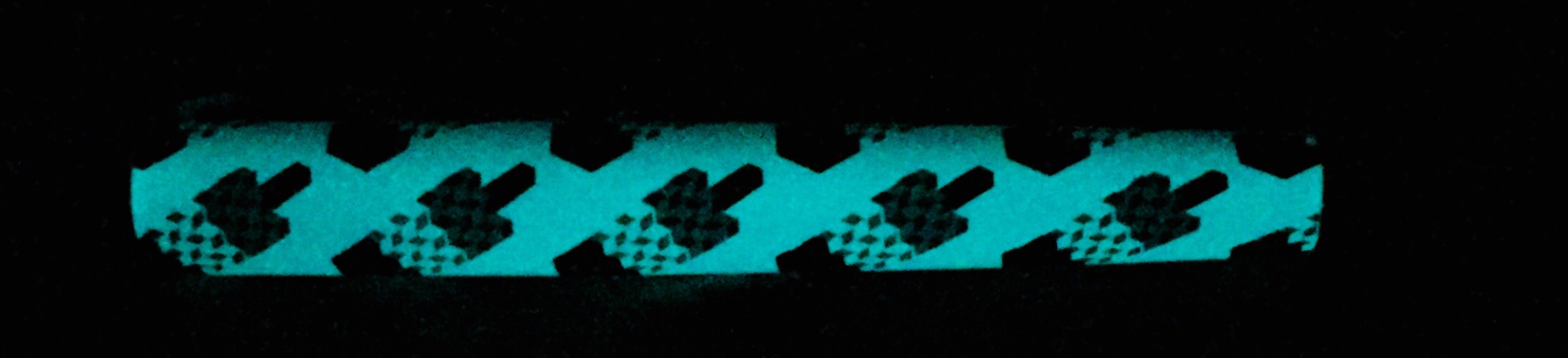
I like the barrel design of the Terabyte 2.0. However, as far as I can tell, it’s identical to the original – hidden Anderson Pen’s logo and all – except that the green motherboard color has been replaced with black. Beyond that, there isn’t much to say about this pen that I didn’t already mention in my write-up for the 1.0.

This disc at the top of the 2.0’s twist even popped off, just like it did for the original. Luckily, that’s an easy fix with some super glue.

I like the stealthy style of the 2.0, but Retro 51 and Anderson Pens probably could have done a little more to make it stand apart – acid etching or a new circuit pattern, for example. That disc at the top has a new bull’s-eye pattern, I guess, but that is hardly significant. It’s really more of a version 1.1.

So, if you feel that you missed out on the Terabyte 1.0, then you’ll be pleased with the Terabyte 2.0. But unlike the original Terabyte, the 2.0 isn’t a limited or numbered edition, so there’s probably no need to rush your order.

.

Retro Talk: Yoshimi & The Pink Robots

Retro 1951 and Brad Dowdy (of The Pen Addict) have come together twice before to produce really nice designs for the Tornado, which is one of my favorite rollerball pens. But this latest collaboration, The Pink Robots Tornado, may be evidence in favor of the old saying, “the third time’s the charm.”

I’ll leave it to Dowdy to tell the story behind the pen — he wrote a great post in which he explains it all. But, in short, the design that wraps around the barrel is an illustration created by Matthew Morse, which is an homage to Yoshimi Battles the Pink Robots, the song and album by The Flaming Lips. If you haven’t heard it, I encourage you to check it out. It’s good!

Morse’s design for the pen wrap is similar to the original Flaming Lips album cover, albeit in a totally different style. It depicts a young Japanese Girl, Yoshimi, wielding a long, pink sword, ready to do battle with a couple of giant pink robots. The twist, clip, and tip of the pen are a all black, and, on the disk inset at the top of the twist, the “pen addict” logo is centered inside a hot pink background.

In my opinion, the best Tornado designs are the ones that adapt the work of artists, like the Bioworkz Edition and the Joey Feldman Edition, or the ones that tell a story, like the Tiger Shark or the Albert. This Pink Robots Edition manages to do both, which is probably why I like it so much. The bad news is that there were only 500 of these pens produced (I’ve got #156), and they sold out quickly. But with the success of this pen, there’s sure to be plenty of creative stuff coming next time Dowdy and Retro 1951 team up.

Retro Talk: The System

img_1817

In April of this year, Mike Dudek of The Clicky Post announced that he had collaborated with Retro 51 to create an exclusive Tornado. Called The System, the barrel of the pen features a stylized, overhead a map of the sun and planets in our solar system (plus Pluto) on a black background. The design looked awesome, so I had to get it.

You may not be able to see it in the pictures, but The System also has glossy black (“dark matter”) strips curving across the barrel that add a little texture, making it a little nicer to hold. The clip, twist, and tip are painted black, and the disk inset at the top of the pen is colored a sun-bright orange. It doesn’t have any acid-etching or glow-in-the-dark elements like other recent Tornados, which may have worked well here too, but I still think it manages to be one of the best Tornado designs out there.

img_1820

It didn’t come without a small bit of drama, however. Initially 300 of these pens were produced, but this was described as an “open numbered edition,” which apparently confused a lot of people into thinking it was a “limited edition.” Like limited edition Tornados, each of these pens has a number stamped near the twist, but Dudek planned to keep making them as long as there was a demand.

While I don’t fully understand the point, the “open numbered” concept really doesn’t upset me. After all, Retro 51 did the same thing with The Flying Tiger. Ultimately, a total of 1,300 pens were produced, and I think the only real angry people were the re-sellers. For my part, I’m just happy to have a cool pen.

img_1821

If you missed out on this one, it unfortunately doesn’t seem like Dudek plans to produce any more – though you can get still get the pencil version, if that’s your thing. But definitely keep an eye out for whatever he does in the future. I know I will.

Retro Talk: NYC Tornado

img_0669

New York, New York. I’ve only visited a few times (and I’ll be going back later this year), but I know that it’s an amazing city – one that I love. So when Goldspot Pens announced this NYC Skyline Retro 51 Tornado late last year, I immediately jumped on the pre-order train.

The NYC Skyline Edition is a standard Retro 51 Tornado in almost every way, except the barrel is wrapped with the iconic structures of New York City. The art includes the obvious and mandatory Statue of Liberty, Chrysler Building, Flatiron Building, and Empire State Building. But the barrel also shows off The Brooklyn Bridge, One World Trade Center (along with the 200 Vesey Street and 225 Liberty Street buildings nestled below), the Bank of America Tower, and the CitiGrooup Center. There’s even one building I can’t ID, but it looks like it could just be generic Manhattan offices.

Tornado-NYC Cap

Another neat feature is the disc at the top of the pen, which features a logo reminiscent of the old NYC Transit tokens. Additionally, like a few other Tornadoes of late, the wrap glows in the dark. With this Skyline edition, however, the gimmick makes sense because it represents the city at night, which, frankly, looks cool.

This is an amazing edition for anyone that loves New York City, but it was unfortunately limited to an odd 333 pieces. So, as you might have guessed, it’s already sold out. If you’re looking for something similar, the Statue of Liberty Tornado is still widely available, or Anderson Pens sells a Chicago Skyline Tornado. It also seems likely that Retro 51 will continue with this line. I can think of plenty that might come next… San Francisco? London? Paris? It will be interesting to see whatever it is.

img_0672

Retro Talk: The Ice-O-Metric Tornado

img_9135

There may be no summertime dessert more iconic than the Bomb Pop  – or, depending on your ice-cream truck guy, maybe it’s the Firecracker Popsicle. Either way, if you live in the United States, this dessert will probably conjure up memories of picnics, parks, and purple tongues. So maybe its no accident that this new Retro 51 Tornado, the Ice-O-Metric, was released in the dead of winter, when I find myself most nostalgic for memories of warm weather.

The Ice-O-Metric design – an 8-bit depiction of the above-mentioned dessert – was created by Michael Jacobs, who wrote a fascinating blog post that details its inception and evolution (a worthwhile read for any aspiring graphic designers). Originally, the design was sold on a t-shirt, but it eventually made it to the Tornado via Brad Dowdy, who sells it on the Pen Addict website.

img_9137

Aside from the red, white, and blue ice pops wrapped diagonally along the barrel, there is a matching disc atop the twist mechanism, and, as a bonus gimmick, the pen also glows in the dark.  It’s a great design, and an excellent sophomore Tornado release from The Pen Addict – the first being a more basic orange model.

I’d say, get your hands on it if you can. It’s a limited edition of 600 pieces, and there’s apparently a risk that they’ll be run over by delivery trucks.

img_9139