
As far as I can tell, Red Blooded Field Notes were made for two reasons. First, so that a Field Notes designer could make a really adorable/cheesy/cute video for his wife on Valentine’s Day. And, second, because the Fall 2011 quarterly edition, Fire Spotter, was so well received that Field Notes wanted to have a similar edition with an open-ended production run (unlike Fire Spotter, which Field Notes limited to 4,000 3-packs).
The all-red cover, including the subtly-embossed logo, looks pretty good, so it’s not a shock that Red Blooded went through a total of three printings before it was discontinued in 2013. I bought this pack a couple of years ago when they could be found through re-sellers, who were still hawking them for a reasonable price. But these days you’ll have to go through eBay to get them, and a 3-pack often runs $40 or $50.

That amount of money definitely isn’t worth it. Compared to recent editions like Lunacy or Black Ice, Red Blooded is fairly basic. It’s the standard pocket size with 48-pages of 50# white paper and a gray, grid ruling. You might think the books would be bound with red staples – that would make sense – but run-of-the-mill silver ones are used instead.
That’s not meant to knock the good people over at Field Notes HQ. A red edition was obviously a good idea, but I’d recommend holding onto that wallet for now. You never know – a fourth printing is still a possibility. And if it comes, hopefully it’ll have red staples.

Additional Notes
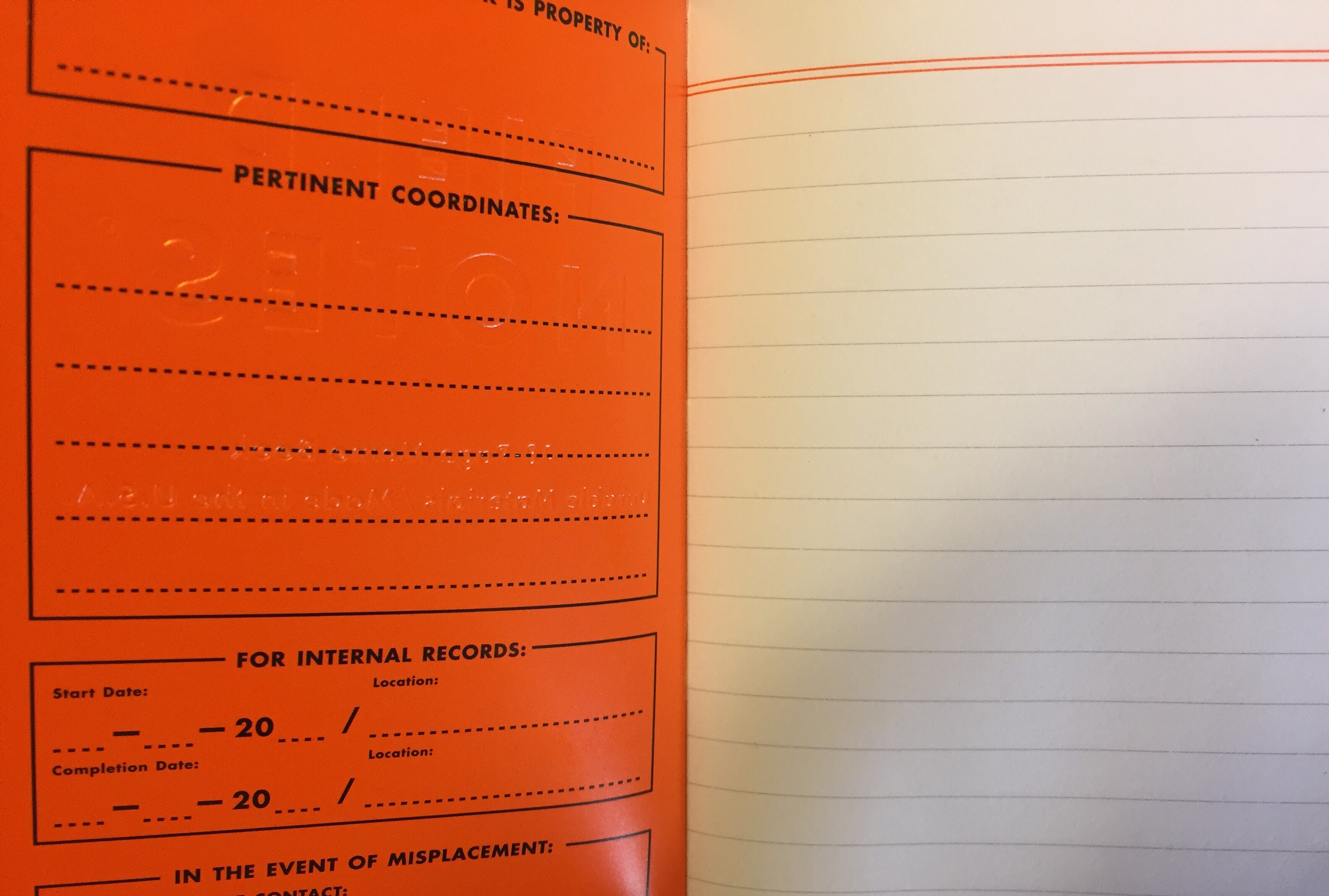
- Of the 30 “Practical Applications” listed in the notebooks’ inside-back cover, my favorites are the following: “03. Lists of Suspected Communists”; “16. Loves Me/Loves Me Not Stats”; and “30. Tape to Cut Through.”
- According to Jinnie at Three Staples, this edition shipped out with a red “Field Notes Loves You” pencil. Blarg! I wish I had gotten one of those.
- What about the edition size? Exactly how many Red Blooded Field Notes were made? Nobody knows!


