Nib Novice, Part 7: Noodler’s Ahab Flex Nib

This is the seventh part in a series in which I’m learning to use fountain pens. For all the previous installments, click here.


img_6003

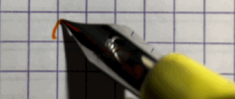
If you watch a flex nib in action, you’re going to be impressed. It’s not only that they’re commonly used by professional calligraphers, but, due to their softer tines, flex nibs are capable of large variations in both line width and shading. I’d been looking forward to trying one out for a while, even though I already have a calligraphy pen that I rarely use.

Unfortunately, outside of the vintage and high-end fountain pen markets, flex nibs can be hard to find. The popular brands, such as the Pilot Falcon, use gold as the primary nib material, putting them in the $150+ price range. For something less expensive, the only option I’ve found is from Noodler’s Ink, which produces several lines of flex nib pens that cost anywhere from $15 to $75.

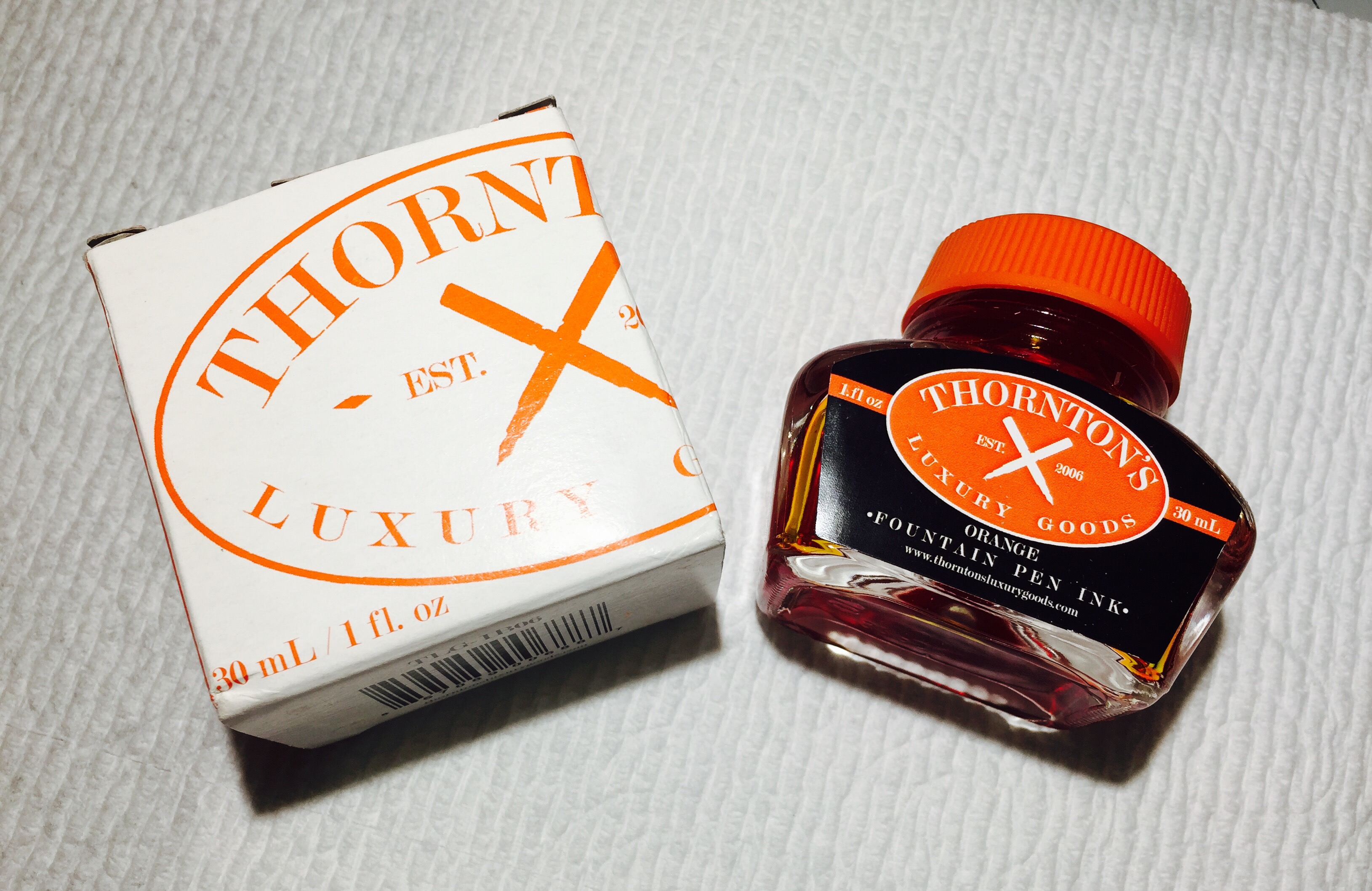
So, not knowing if I’d actually enjoy this nib style, I went with something on the cheaper side: the Noodler’s Ahab with the”Bumblebee” barrel design, which cost me about $23. For ink, I went with Thornton’s Orange – a bright color to match the bright barrel – for an extra $9.

img_5991

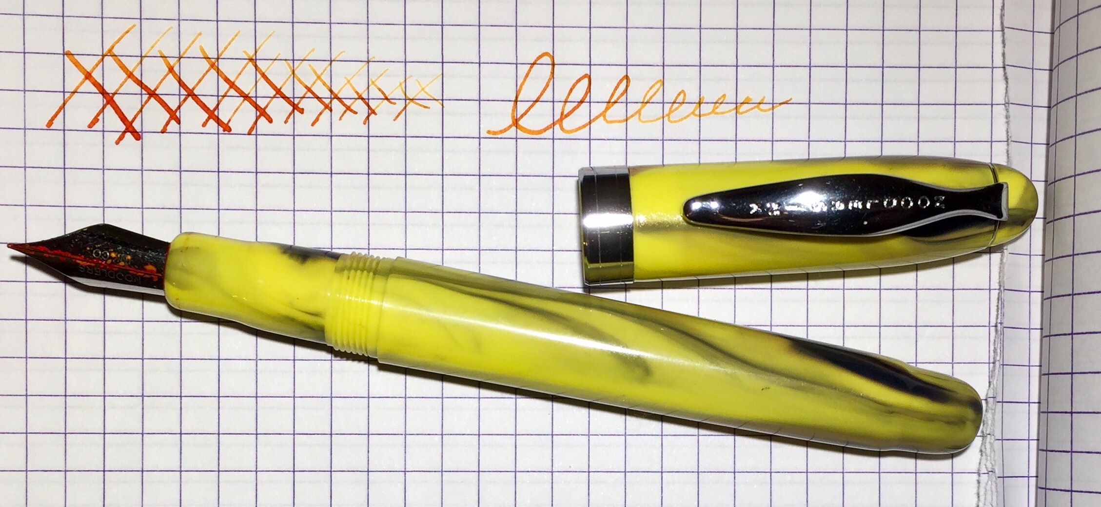
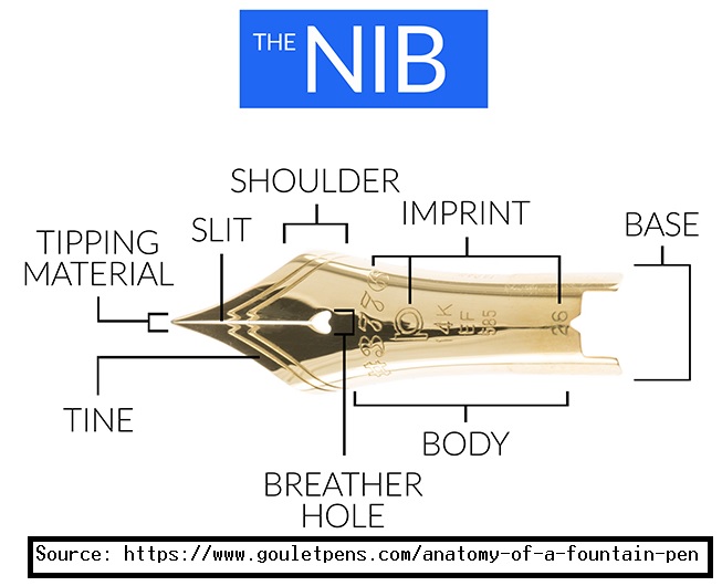
After inking up the pen, I experienced some initial frustration until I found this guide from Goulet Pens, and I realized that operating a flex nib demands a different touch. Typically, fountain pens glide across a piece of paper with very little (or no) need to apply force. Flex nibs, on the other hand, require pressure. The more the nib is pressed down, the more the tines will separate (i.e. “flex”) to allow for greater ink flow.

This line variability allows for some very artistic writing. However, it does take some practice to master. One guide at VintagePen.Net even asserts the importance of proper posture while writing with a flex nib. That may be overkill for a non-professional fountain pen user, but playing around with varying pressures and writing angles is still a lot of fun.

The Noodler’s Ahab – and flex nib fountain pens in general – are definitely not functional. By that I mean to say, you probably wouldn’t want to take notes with it. Flex nibs don’t seem to be very good with the block-style fonts like I typically use either. So, it would be rational to assume that I wouldn’t like this pen, but I do. This flex nib is such an enjoyable writing experience that I’ll find an excuse to use it… even if it’s only for signing holiday cards.

Review: Tombow Zoom 707, Ballpoint, 0.7mm

img_5964

The Tombow Zoom 707 is nothing if not distinctive. Between the accordion-like twist, the red ball at the end of the clip, and the protruding grip, it looks like no pen I’ve seen. In fact, it seems almost like a novelty pen.

That’s not to disparage it; the Zoom 707 is clearly a high-quality pen. It has a durable, metal barrel, a clip that secures snugly, and a twist mechanism that ejects the pen’s tip smoothly. It has a soft, rubber grip and comes with a ballpoint refill that’s comparatively darker and smoother than most (though some ink blobbing does occur).

tombowzoom707-features

Due to its size, however, the Zoom 707 is the kind of pen that’s best slipped inside a planner or pocket-notebook. Despite the grip section, which is noticeably thicker than the pen’s barrel, the Zoom 707’s slenderness is simply impractical for writing longer notes or letters. Writing at any length quickly becomes uncomfortable.

The Zoom 707 will likely run you anywhere from 15 to 35 dollars, depending on which color you’re after, and, to me, that seems a bit pricey given its limited practicality. If you’re in the market for a super-slim pen, I’d recommend checking out the Pilot Couleur. If you just want a unique-looking Tombow pen, I’d suggest the Airpress. The Zoom 707 is a nice pen, but it’s hard to beat these alternatives, as they typically run in the 5 to 10 dollar range.

img_5971

Retro Talk: A Tribute to Gray’s Anatomy

img_5936

When I was in college I bought myself a copy of Gray’s Anatomy – not to be confused with Grey’s Anatomy, the TV show – edited in the form of a coffee table book. At the time I didn’t own a coffee table, but I really liked the anatomical drawings. The illustrations are something almost anyone can appreciate, as they are an amazing example of functional art. Each drawing takes attention to detail and a lot of study.

So, when Retro 51 released a Tornado design earlier this year named Dr. Gray, I didn’t wait long to place my order. The barrel features an anatomical drawing of the skeletal system with 30+ of the major bones identified. I’m not sure whether this illustration is a Gray’s Anatomy original or if it has been redrawn by another artist, but, either way, it would be good enough for at least a couple of correct answers on a biology exam.

graysanatomybook

Like the Albert Tornado, this design is part of Retro 51’s “Vintage Metalsmith” series, which mainly means that the metal on the clip, twist, and tip has been weathered. One fairly unique feature, however, is that the Dr. Gray glows in the dark after being exposed to light. Since I usually keep pens in my pocket (and I don’t use them in the dark), it took me a while to notice. Throw it directly under a bright bulb for 10 minutes, however, and it glows quite brightly. It’s a neat little gimmick that gives it a Halloween vibe.

I like the Dr. Gray, although, at $40, it’s more expensive than many other Retro 51 Tornado designs. But if you know an orthopedist or a med student, it would probably make a really cool gift.

img_5939

Review: e+m Slim Line, Ballpoint, Medium Tip

img_5929

Wood, for whatever reason, is not a material that’s typically used for pens, but the German company e+m seems to prefer it. e+m makes a handful of wood-barreled pens, one of which is this Slim Line model that comes in three finishes: black, white, and “natural.” It’s this natural look that I like the best, and my girlfriend seems to agree; after I first used it, she snatched this ballpoint off my desk and said, “ooh… pretty!”

The Slim Line is primarily made from beech wood. It’s a good choice –  it feels like a softer wood, so it’s fairly comfortable to write with. The accents are all metal (which makes a lot of sense for the clip), but this natural finish version comes with a wooden clicker that looks like a golf tee protruding from the top. I like it.

img_5930

The only downside to this e+m pen is that it uses a generic, blue ballpoint refill, the kind that you might find in a promotional pen. It’s okay if you’re comfortable having a scratch-pad handy, otherwise you’ll be annoyed by ink stuttering. This e+m pen design doesn’t work well with other refills either – most are too fat to fit inside the barrel. Cult Pens recommends a Schneider Express 775 refill (they can be found for a little over a dollar a piece), but I can’t vouch for that refill myself.

Regardless, the e+m Slim Line is such a unique-looking pen that I’m still happy to pick it up from time to time. It’s not the type of thing that will fully satisfy a pen nerd, but it would make a good stocking-stuffer. And it doesn’t hurt that these can easily be found for under $10.

img_5931

Book Review: Pretty Much Everything by Aaron Draplin (+The Everything Else Kit)

Aaron Draplin might possibly be the most prolific graphic designer of our time. He’s best known for making logos, producing a lots of stuff, and creating the booming Field Notes brand of notebooks. This year he decided to cram his life’s work into a book, appropriately titled, Pretty Much Everything.26240629

Pretty Much Everything is an autobiography, a textbook, a coffee-table book, and a vanity project all squeezed between a bunch of black and orange pages. Much of the book chronicles Draplin’s career, from his humble origins in the Midwest, to his snowboarding days in the Northeast, and the steady growth of his Draplin Design Co. brand. He talks a lot about his influences and his family throughout, and he offers up his design philosophy (which can probably be boiled down to something like ‘work hard, enthusiastically, and be nice to people’).

Just looking through the pictures, it’s hard not to be impressed by Draplin’s output. Between his fondness for bright colors, his “thick lines” artistic style, and his aptitude for space economics, it’s easy to flip this book open to a random page and just sit and stare for a while. Practically every inch of this book is filled with stuff to look at.

img_5884

Aside from a couple of big grammatical errors, Pretty Much Everything is really quite a delightful book. Any student of graphic design will learn a lot, any fan of Field Notes notebooks will get their fill, too, and lovers of Pantone Orange 021 will find a kindred spirit within these pages as well. And beyond that, Draplin comes across as a very friendly person, someone who lives and dies by his friends.

Everything Else Enhancement Kit

If, after closing the final pages of Pretty Much Everything, you long for more Aaron Draplin, then you’re in luck. Along with the book’s release, Draplin began selling an “Everything Else” Enhancement Kit (aka EEEK), which includes a bunch of bonus stuff.

img_5883

At $55, the kit is about double the price of the book. So it’s probably best considered by hardcore fans only. However, you will get your money’s worth. There are bookmarks, stickers, a handful of prints, a certificate of authenticity (in case you were worried), and a Pretty Much Everything slip case (that, to my eye, looks more red than orange).

There’s plenty of other stuff too; a pencil, a button, a patch – and two 3-packs of a special Field Notes edition. Those Field Notes books are pretty unique, and I’ll definitely have a lot more to say about them in a future review.