Looking Ahead to 2018

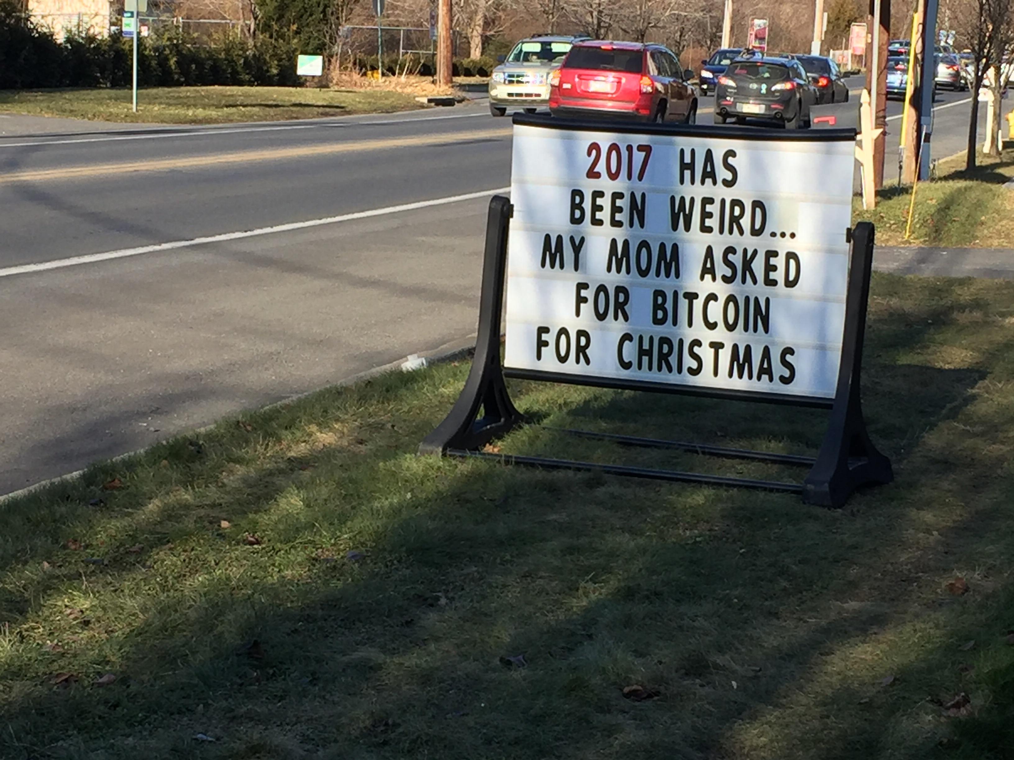
There’s no doubt about it, 2017 has been a weird year in ways big and small. There were tons of divisive political stories, of course, and a solar eclipse that briefly brought everyone back together. Apple also released a cool new iPhone that is way too expensive, and the new Star Wars movie turned out to be quite polarizing. As I said, a weird year, but at least things here at the Pens and Junk blog have been good & steady.

happy2bnew2byear2b20182bfree2bdownload2bwallpapers2bpsd

This last year, I managed to publish thirty-three new posts, and the site subsequently saw a modest 11.4% uptick in traffic. Not too bad.

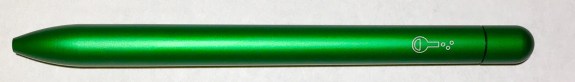
My pick for 2017 Pen of the Year is a tough one, however. Retro 51’s Bioworkz Tornado and Hex-o-Matic both get honorable mentions, but, ultimately, the emerald-green Squire Experiment by Baron Fig takes my top slot. It’s a bright and beautiful pen, and it’s no surprise that it sold out immediately.

Baron Fig Experiment Squire

In 2018, the blog will march on. I’ve never liked making New Year’s resolutions, so I thought I’d try a list of goals instead. So, here’s some of what I’ll hopefully accomplish on Pens and Junk this year:

  1. I need to fix all the times I misspelled stationery as “stationary.” That one should be simple.
  2. Finish my Nib Novice Series. I’m so close to being done.
  3. Do a minor site redesign. It’s time.
  4. Do something for charity. I have a couple ideas, though suggestions are always welcome.
  5. Write more book reviews, two or three off-topic posts, and create some index pages to help with organization. That seems straight-forward enough.

img_9036

And as always, I don’t want to forget about all the non-pen stuff to look forward to in 2018:

I’m pretty excited about that Han Solo movie (though I will tempter my expectations), as well as a new Avengers movie.  And of course there will be more – too much! – good TV to watch, the new seasons of Jessica Jones and Westworld in particular. I also still have to figure out who I’m rooting for in the 2018 World Cup and which Winter Olympics events to follow (maybe curling?).

And will this be the year George R.R. Martin finally releases the next book in the Game of Thrones (i.e. A Song of Ice and Fire) series? Probably not. But let’s not let that put a damper on our year.

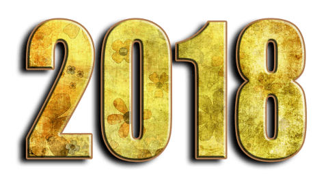
I hope everyone has a wonderful 2018!

Notes on Carhartt Field Notes

img_8138

Field Notes and Carhartt are a lot alike; Both companies are headquartered in the Midwest. Both companies appeal strongly to the blue-collar and the hipster demographics. And both companies exude pride that their products are manufactured in the U.S.A. It was only a matter of time before the notebook company and the apparel company got together to create a custom set of Field Notes pocket notebooks.

Each pack contains three 3.5” x 5.5” notebooks, and each has its own theme. There’s the orange book for hunting, the green book for camping, and the blue book for fishing.  The covers feature a slick two-tone version of the Carhartt logo (a zoomed-in curlicue “C”), and the back cover tells a short history of the Carhartt company, as well as some general tips for using Field Notes notebooks.

img_8139

These notebooks use 100# cover stock and 60# white inner-paper with a brown, lined ruling. In concept, these books seem very similar to the Campfire Edition, though the Carhartt Field Notes seem much simpler overall. And, honestly, I prefer this simpler look. It’s a clean cover design, yet it still pops, and the graphics on the back feel very 1950s retro.

As long as you’re okay using lined paper – I know, I wish they used graph paper too – I definitely recommend grabbing a pack. Most of the time these Field Notes editions are long sold out by the time I write about them, but luckily, these Carhartt books are still available on their website. It’s like a Christmas mini-miracle.

img_8943

Additional Notes

  • Each of the three notebooks have (mostly) their own themed “practical applications” list. From the camping book, my favorite is, “06. Sasquatch Composite Sketch.” From the hunting book, my favorite is, “25. Wild Boar Attack Formations.” And from the fishing book, my favorite is, “02. Old Fishermanisms.”
  • Carhartt used to make old-school “field notes” notebooks, apparently.
  • You know who likes lined ruling? Leadfast does. Check out the review of Carhartt Field Notes over there.

Review: Zebra Sarasa Grand, Gel Ink, 0.5mm

img_8893

It seems that when a gel pen reaches a certain threshold of populairty, it inevitably gets a metallic upgrade: Pentel created an “alloy” version of their Energel, Pilot turned their blockbuster G-2 into the G-2 Limited, and now Zebra has made a “Grand” version of their Sarasa. The barrel of the Sarasa Grand is made of brass, and, as you’d expect, it’s a hefty pen. It is bottom-heavy in particular, so it only takes a light touch to get the ink flowing.

Additionally, the Sarasa Grand has a spring-hinged clip that allows it to clip to thicker notebooks, and doing so more securely.  Perceptive readers might note that Zebra makes another version of the Sarasa with a spring-hinged clip called, obviously, the Sarasa Clip. But the clip isn’t the only similarity between the two pens. Both the Sarasa Grand and the Sarsa Clip include the “Zebra JF” refill, whereas the standard Sarasa uses the “Zebra JLV” refill. The “JF” refill is darker and smoother than the “JLV” refill, so including it with the Sarasa Grand was a good choice by Zebra.

img_8891

The barrel comes in four colors: black, navy, pink, or (my choice) gold. There’s also a great accent on top of the knock (a little plastic jewel), and a window underneath the clip that is supposed to allow for a view of the refill’s ink level. However, the view is so limited that we’ll just have to call it a decorative window. Additionally, there are grooves on the grip section that do a good job of increasing friction, which will help to prevent your fingers from slipping while writing.

Generally I really like the Sarasa Grand, though that comes with one major caveat: the lever of the spring-hinged clip extends way too far above the barrel. It sounds like a small complaint, but this lever gets in the way whenever I try to click the pen. Similarly, if you ever click your pen upside-down on a desk, it’s not possible here – the clip blocks you.

If this sounds like a silly complaint, then definitely get yourself a Sarasa Grand. Everything else about this pen is good. But for me, this clip issue is annoying – not enough to make me hate this pen, but enough that it’ll probably end up collecting dust in a pen cup.

img_8885

Extra Links

Book Review: The Secret Life of the Pencil by Alex Hammond and Mike Tinney

9781786270832

The Secret Life of the Pencil: Great Creatives and Their Pencils started out as a photographic project by Alex Hammond and Mike Tinney. The concept is a simple one: the duo asked renowned creatives – artists, designers, architects, etc. – to send in their pencils, and then these tools were photographed in extreme close-up. The result is a book full of wonderfully detailed, bright, and captivating photographs that will easily draw you in.

That’s not all, though. There is also a short introduction by writer William Boyd and a series of interviews at the end of the book conducted with twenty-one of the aforementioned pencil owners. If I have one complaint it’s that I wish the interviews were integrated with the photography (rather than being stacked in the back), and I also wish there were more of them.

img_8808

Many of the interviewees also contributed drawings done with their pencils. My favorite happens to be be the concept designs for Lego characters by Matthew James Ashton, but I also liked seeing the courtroom art of Julia Quenzler and designs of makeup artists Michèle Burke.

It’s easy for me to recommend The Secret Life of the Pencil. It’s a short and inexpensive book, easily found for under $15, and it would be great for the coffee-table or as a small gift for any creative person. And if you really like the photographs, the book a heck of a lot cheaper than ordering the prints.

Review: Muji Hex Oil, Ballpoint, 0.7mm

img_8685

Earlier this year, my girlfriend and I took a short trip to Manhattan where, completely unintentionally, we happened upon a Muji store. If you’ve never heard of Muji before, it is sort-of like the Japanese’s answer to Crate & Barrel. It’s a store full of household items, clothing, and stationery products, though all of it is unbranded.  It’s trendy and cool, and it’s difficult to walk into a Muji store without buying something. Short on time during my New York vacation, I settled on this simple Hex Oil pen, which cost about $1.50.

img_7583

The name “Hex Oil” does a pretty good job of describing the pen itself. It has an all-black, hexagonal barrel – like a cross between a pencil and a Signo RT1 – and it uses ballpoint (oil-based) ink. As you might expect, the pen itself feels very much like a pencil in hand. Even though it lacks any sort of grip, the hexagonal shape does a good job of making it fairly comfortable to hold.

The ballpoint ink, on the other hand, isn’t very good. It feels sluggish, so your hand is bound to get tired if you plan on writing a lot. Also worth noting: the ink also has a minor blobbing problem, the clip is fairly flimsy, and the refills cost a dollar each, which is way overpriced.

Perhaps a recovering pencil-addict will get enjoyment out of the barrel, but better pens exist that cost less money. Check out the Skilcraft U.S. Government Pen or the Paper Mate Inkjoy 550RT instead. They may not look as unique, but you’ll have a better writing experience.

img_8686