Notes on Black Ice Field Notes

img_5932

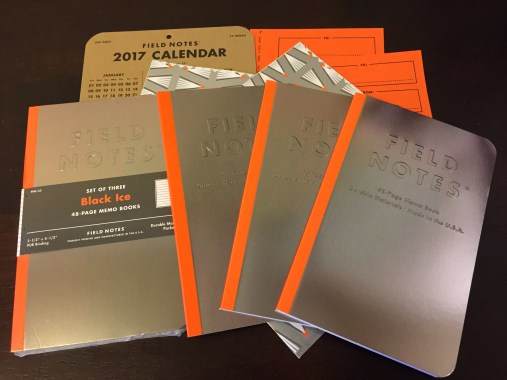
It’s hard to know where to to begin with Field Notes’ 33rd quarterly edition (winter, 2016). In a snapshot, it’s the typical 3.5″ x 5.5″ pocket-notebook with 48 pages of 70#, line-ruled paper. But with this notebook, which Field Notes has named the “Black Ice” edition, there’s actually a lot more going.

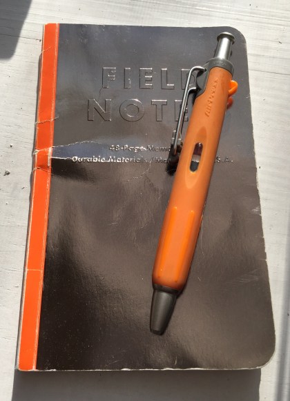
This notebook has a hefty 100# cover stock that is stamped with a dull, reflective foil. The cover shows cracks and scratches with wear, but somehow never seems to leave smudges or finger-prints. It ostensibly represents the shiny, gray coloring of a thin layer of ice on asphalt. It’s a clever design, though not one that’s easy to photograph.

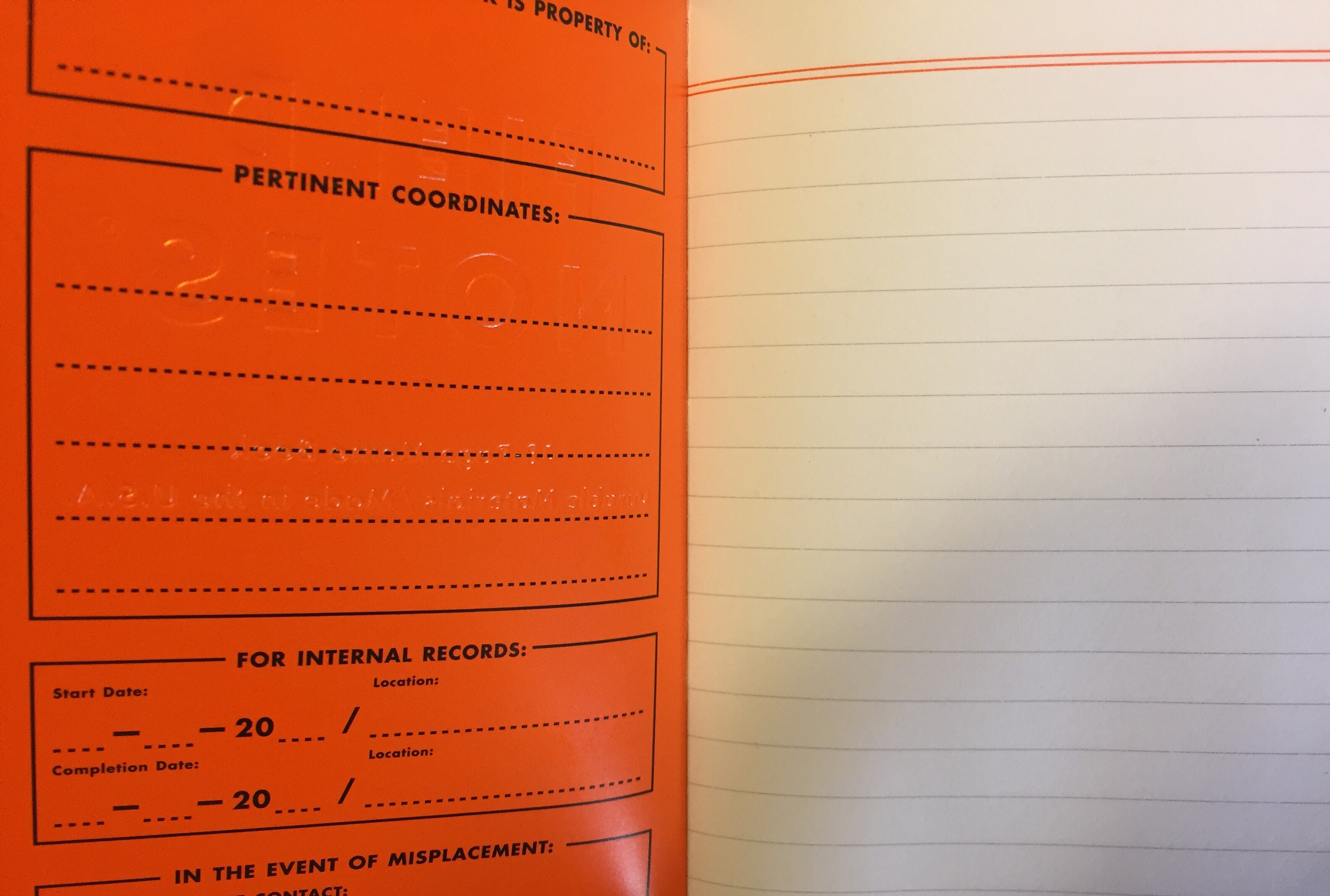
Oddly, there’s also a lot of orange with this edition – the orange spine,  the glossy inside-cover section, and the ruling that lines the header section on each page – which is perhaps an ode to the Field Notes creator, Aaron Draplin. Not that I’ve got nothing against orange, but I don’t see how it makes much sense with the “Black Ice” theme. A dark gray would have worked better, in my opinion.

img_6713

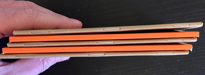
The most unique feature of the Black Ice edition, however, is the use of PUR binding, a first for Field Notes. Instead of stapling the pages together, each leaf of paper is glued into the book, and the spine is then covered by an orange, rubbery hinge. The obvious advantage to PUR-binding is that it creates a much tougher spine for the notebook, though it also adds some bulk and prevents pages from easily laying open. As someone who typically keeps these notebooks in a back pocket, the extra bulk isn’t ideal, though I wouldn’t describe it as particularly cumbersome either.

Overall, anyone who uses Field Notes is likely to enjoy the Black Ice edition, though it doesn’t personally rank among my favorites. The bulkiness of the PUR binding can be a little annoying, and I’m not in love with the use of orange. On the other hand, the reflective covers look good, the pages are hefty, and it’s a durable little book. No doubt this edition will find a lot of fans, but I wouldn’t be surprised by the fact that it also has a few detractors.

img_6712

Additional Notes

  • Of the 30 “Practical Applications” listed in the notebooks’ inside-back cover, my favorites are the following: “02. Curling Rosters”; “24. Plunges Polar-Beared”; and “27. Bells on Bob Tails Rung”
  • With the Field Notes quarterly subscription, this edition came with a couple pieces of wrapping paper and gift labels. It was a smart assumption by Field Notes that these notebooks, released prior to Christmas, would be gifted. Though, I used the wrapping paper I received to wrap other gifts.
  • Check out some other good Black Ice reviews at Fountain Pen Follies, Lead Fast, and Nerd Gazette.

Review: uni-ball Vision Elite, Rollerball, 0.8mm

img_6224

At 2 to 3 dollars apiece, the uni-ball Vision Elite is a pen that’s positioned at the top-end of the inexpensive, plastic market. It’s the sort of pen you’d expect to be handed at a car dealership just before signing a lease agreement. It contains a dark ink, has a sturdy clip, and features a thick, robust barrel. However, the most impressive thing about the Vision Elite is its ink – advertised as “super ink” – that barely smudges or smears at all.

On the other hand, the ink doesn’t flow all that consistently, and this 0.8mm tip provides a much bolder line than I expected (although, uni-ball does make finer-tipped versions, at 0.5mm and 0.7mm). Additionally, I should mention that I had problems with the cap, which would constantly pop off whenever I tried posting it to the end of the barrel. Though, these “designer series” versions of the Vision Elite, which differ only in aesthetics, do look pretty snazzy.

img_6225

If you’re looking for a fairly inexpensive, low-smear rollerball pen, then the Vision Elite is a good choice. If you can tolerate some smear, then I’d recommend checking out the Pilot Precise instead. Or if you’re okay with a gel pen, then the uni-ball Signo 207 contains similar low-smear ink as this pen. But overall, the Vision Elite is a decent, smooth and comfortable pen, even though it wouldn’t be my first choice.

img_6223

Extra Links

  • Art Supply Critic has a review that features the red and blue versions of the Vision Elite. He mentions some bleed through issues, which will definitely happen on thinner paper.
  • Here’s a very positive review at The Clicky Post. It’s mentioned here that refills for the Vision Elite can be purchased separately, though you’ll spend about the same amount of money if you just decide to buy a new pen.
  • And, of course, this was reviewed by The Pen Addict. It’s mentioned here (and in the pen’s advertising) that the Vision Elite is airplane safe. Though, honestly, I’ve never had a problem with pens exploding on airplanes. So I’m not sure that this is a unique feature.

Squire Sub No. 01 – The Alphabet Edition

img_6208

Late last year, the guys at Baron Fig announced three new subscription services; one for their Confidant notebooks, one for their Archer pencils, and one for their Squire pens. I already have too many notebooks, and I don’t really use pencils. But the Squire pen subscription – that is something I was interested in, especially after my original Squire, from Baron Fig’s Kickstarter campaign, was lost. So I purchased the subscription, and the first of four quarterly edition Squires arrived at my doorstep earlier this week.

With this first limited edition, called “Alphabet,” Baron Fig played it pretty safe. There is very little I can say here that I didn’t already write in my review for the original Squire – it’s identical in regards to size, shape, refill, construction, and twist mechanism. The big difference is that this edition has a matte black body, whereas previous color options were silver and charcoal. And in place of the Squire sword logo, this edition has the 26 characters of the English alphabet printed vertically down the pen’s barrel.

img_6210

Besides that,  the packaging has also been updated from a square box to a rounded one (a close resemblance to the current Retro 51 Tornado packaging), and the twist retracting mechanism seems a bit smoother.

Although the ‘alphabet’ theme seems superfluous, I do think it makes sense for the very first pen in the Squire subscription-series to be fairly standard. Frankly, I’d have been just as happy with an all-black “stealth” edition. Still, I wouldn’t mind something a little more exciting next time, such as a bright color or (dare I suggest?) a pocket clip. But whatever Baron Fig ends up doing with the second Squire in this subscription-series, I suppose it’s a good sign that I’m looking forward to finding out.

img_6209


Nib Novice, Part 8: Platinum Preppy Conversion

This is the eighth part in a series in which I’m learning to use fountain pens. For all the previous installments, click here.


img_6186

For those interested, fountain pens can provide plenty of “DIY” opportunities. Cleaning, nib swapping, and basic restoration projects seem to be fairly commonplace, for example, but an eyedropper conversion was the one project that really peaked my interested. An “eyedropper” refers to a type of fountain pen filling system (or lack thereof) where all you need do is pour or pipette a load of bottled ink into a pen’s barrel. So an eyedropper conversion is just like it sounds, when you take a pen that doesn’t have an eyedropper filling system and modify it to have one.

There are a couple benefits to having an eyedropper fountain pen. First, with the pen’s entire barrel filled, it holds a maximum amount of ink, significantly reducing refill frequency. And second, an eyedropper is easy to manage and clean, as opposed to filling systems that are a little more complicated (I’m looking at you, Parker 51). Additionally, I’m converting a Platinum Preppy, a pen which uses proprietary ink cartridges. So rather than being forced into using Platinum’s inks, I’ll be able to use any ink I’d like in this pen. Incidentally, I’ve decided to go with the gray-ish colored “Charles Dickens” ink by DeAtramentis.

Now to get started…

img_6184

The whole process is actually deceptively simple, and a good guide can be found at the JetPens Blog. The basic procedure is this: First, grab a bottle of ink and buy a Platinum Preppy – these pens are widely available for under $5. Then find a #5 O-ring and a small bit of silicone grease. Both these items can be found at most hardware stores, but I took the lazy way out by ordering a 4-pack of O-rings from Goulet Pens, and I’m using the silicone grease that came with my TWSBI Eco.

From there, you simply  (1) unscrew the barrel of the Preppy, (2) get rid of the proprietary ink cartridge, (3) slip the o-ring over the threads, (4) cover the threads will the silicone grease, (5) pour or pipette ink into the barrel of the Preppy, and (6) screw the pen back together. Give it a few shakes, and you’re good to go. Maybe that sounds complicated, but the whole process really only takes about 5 minutes.

The difficult part is more psychological. Thing is, the drawback to doing this eyedropper conversion is that by getting rid of the ink cartridge, I’ve effectively removed one barrier between the outside world and the ink that’s inside the pen. A cheap, plastic barrel is the only thing preventing an inkpocalypse while writing with it. Or, if the barrel’s threading comes loose while the pen is in my pocket, my pants would basically be done for.

So, though I was slightly terrified to do so, I decided to use this pen for the day. I carried it around at work, praying the whole time that I wouldn’t accidentally drop it or crack the plastic somehow. But in the end, well, it worked great! The Preppy’s fine nib writes clean and consistently, and I love any fountain pen with a pull-off cap. Overall, it’s a bit scratchy, but it’s still very good for such an inexpensive fountain pen. And while my fear of getting ink everywhere hasn’t fully evaporated, it has been significantly diminished.

img_6200

It turned out to be a fun project, and something I’d recommend to any fountain pen newbie.

Retro Talk: In Vino Veritas

img_6171

The Retro 51 Vino Tornado was first sold in 2007, but I didn’t hear about it until late 2015 when it was re-issued and sold by the now defunct Paradise Pen Company. The design immediately caught my eye, but it could only be purchased as a $70 pen and pencil set, and, unfortunately, I was really only interested in the pen half. So I put it to the back of my mind, thinking that I’d eventually find someone who wanted to split their set.

A little over a year later, after I’d mostly forgotten about it, Retro 51 announced via social media that the Vino Tornado (pen only) had once again been revived in a limited quantity for Fahrney’s Pens. So, not being one to hesitate, I jumped on the deal.

img_6182

The Vino is undoubtedly distinct from every other Tornado I own. Unlike many of the Tornado designs, which are mostly lacquered wraps, the barrel of the Vino is made of an entirely different material called, according to the marketing material, ‘durable cork.’ The more truthful description might be artificial cork, which feels quite rubbery and soft. (UPDATE: Retro 51 says that it is indeed authentic cork). However, that doesn’t diminish the design. This material makes it a little more comfortable to hold and a little easier to grip. Additionally, the barrel is textured with cracks and divots, giving it a more realistic look and feel.

Aside from the barrel, the remainder of the design is standard for a Retro 51 Tornado. It has silver accents with a tan finial disc, and it comes equipped with the standard 0.7mm Retro 1951 refill. I’m quite happy to own this Tornado, though it would obviously make a great gift for any wine-enthusiast. It pairs well with a tasting book and fancy bottle of shiraz.

img_6178