
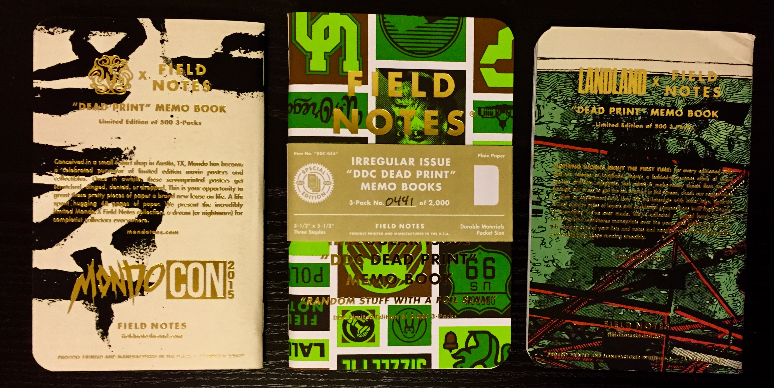
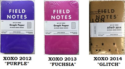
Every year, the halls of the XOXO Festival – an art and technology conference out of Portland, Oregon – have been complimented by an exclusive edition of Field Notes pocket-notebooks. In 2015, the conference engaged artist Brendan Monroe to create artwork that adorned the notebooks’ covers, which was a very good decision (it just so happens that the XOXO 2015 Field Notes are one of my favorite editions). So for the XOXO 2016 notebooks, I was happy to see that another artist was again involved, and the resulting designs can justly be described as an explosion of orange and pink.
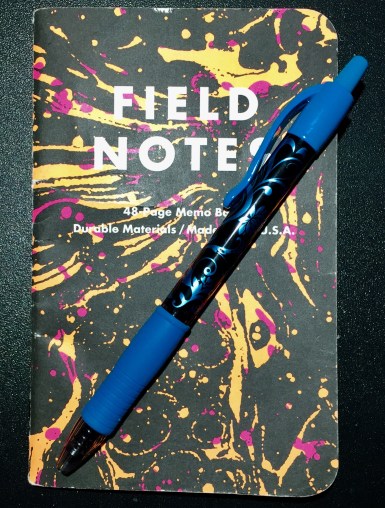
This marbled/tie-dye cover-art was created by Mark Weaver, a designer and illustrator based out of New York, and from what I’ve seen on his website and Flickr account, he has an artistic style that might be described as ‘funky modern.’ For the XOXO 2016 notebooks, he created artwork that is bright, trippy, eye-catching, and generally just pretty cool. Inside the books, 60# white paper is ruled with bright-orange grid-lines, a color that I’ve found looks particularly good behind bright-blue ink.

This edition is another win for XOXO, but I hate to talk these notebooks up too much, as they are difficult to find. Attendees of the XOXO conference were easily able to get a 3-pack, but I was able to get mine a few weeks later when extras were made available on the Field Notes website. They sold out quickly, however, and the best bet on finding a set now is through eBay where they will likely be overpriced (though it looks like they might still have some available at their Chicago home base).
So, good luck to you if you’re on the hunt for this Field Notes edition. They are, after all, probably one of the better things to come out of 2016.
Additional Notes
- The “Practical Application” list in the back cover is, unfortunately, just the standard list used in the basic kraft notebooks, but at least it was printed in bright pink.
- I’d suggest keeping an eye out for next year’s XOXO Field Notes, but an e-mail from Field Notes mentioned that the 2016 XOXO Festival might have been the last one. We’ll have to wait and see, I guess.
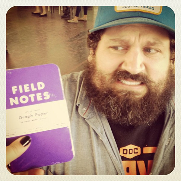
- For the first year of the conference in 2012, the XOXO special edition Field Notes had solid purple covers. Ironically, Aaron Draplin (the creator of Field Notes) hates the color purple. He’s said, “I don’t use purple in anything. It’s the color of royalty. It’s the color of sweaters on cat people. Just don’t do it.” Maybe that explains this picture.


