Review: TUL Retractable, Gel Ink, 0.5mm

img_4994

If you find yourself doing some back-to-school shopping at Office Depot, OfficeMax, or any subsidiary thereof, then you’ll probably spot some of the company’s TUL brand of pens. There’s actually a whole TUL family, which includes ballpoints, rollerballs, and mechanical pencils. But, of course, I was drawn to the TUL retractable gel pen – it has a needle point, a 0.5mm tip, and is exactly the sort of pen I typically like for daily use.

The look of the pen is right on. The black and gray fade on the barrel looks pretty cool, and the TUL logo right in the middle is simple and bold. I even like the demonstrator-ish look of the knock and the plastic, black accent on the clip. Although, in hand it feels a little cheaper than it looks. The aforementioned clip seems a bit flimsy, and the rubber grip could use a little extra cushion.

img_4995

In terms of performance, the TUL retractable is good but not great. Its gel ink is dark and smooth with minimal smearing, though I had some issue with ink flow consistency. It sometimes fluctuated between finer and heavier lines, but this happened to only be an occasional problem.

Overall, it doesn’t fall on the top of the “retractable gel pen” heap alongside my favorites (e.g. the Energel Deluxe RTX and the uni-ball Signo 207), but I do like it nonetheless  If these go on sale after the back-to-school shopping season, then I might just have to pick up a couple more packs.

img_4996

Extra Links

Review: BIC Bu3 Grip, Ballpoint Ink, 1.0mm

img_4956

In most aspects the BIC Bu3 Grip is a standard, if not slightly-below-average, ballpoint pen. The ink flow is on the sluggish side, it has a tendency to skip in and out while writing, and there’s more ink blobbing and smearing than one should expect from a $1 pen. On these points alone, I’d hesitate to recommend this pen to anyone, but there’s a little button on the side of the BU3 that pushes it into the “I’d never want to pick this pen up ever again” category.

img_4957

The button, located near the clip, acts as a retracting mechanism. The tip still ejects by clicking a knock at the top of the pen, like you’d typically expect, but you can only retract the pen’s tip by pushing the button. Why? The Bu3’s packaging states that it’s “for added convenience,” but it really isn’t convenient at all. I’ve seen similar retracting mechanisms that actually do serve some purpose – the Pilot Down Force comes to mind – but the Bu3’s retracting mechanism is, at best, mildly annoying.

Really, I’m having trouble finding good things to say about this pen. The grip is somewhat comfortable, I guess, but that’s hardly redeemable. So, unless you have no other options, my suggestion is to just avoid the BIC Bu3 Grip.

Retro Talk: The Tiger Shark

img_4930

The Flying Tigers – officially called the 1st American Volunteer Group – were a band of Air Force squadrons sent to defend China against Japanese attacks during Word War II. They were successful and popular in their time, but they are probably best remembered for the creative paint jobs they gave to their P-40 Warhawk fighter planes. So, in August 2015, 70 years after the end of WWII, Retro 51 announced a Tornado pen in tribute to the Flying Tigers.

The Flying Tiger Tornado turned out to be a very successful product: 500 pens were made, and they sold out fast. I missed out, unfortunately – I hadn’t gotten my first Retro 51 Tornado until a couple weeks after the Flying Tiger was released, so it was long gone by the time I caught wind of it. To my delight, the design was so popular that Retro 51 decided to release two more versions of the pen earlier this year, the Tiger Shark (the one I have, pictured above) and the Fortress (pictured below).

TigerShark_vs_TigerShark

All three pens feature a design printed on a lacquer wrap with acid-etching for detail. The acid-etching is especially cool, as it adds texture to the rivets and grooves in the paneling. To give the pen a grittier look, the metal of the nosecone, clip, and twist have been artificially weathered. All three pens look great, but I especially like the camouflage on the Tiger Shark. The “Dear Becky” insignia on the Fortress design is also pretty great, but it lacks the iconic set of shark teeth at the pen’s tip.

This has got to be one of my favorite Retro 51 Tornado pens. Like the Albert Tornado, the pen has a great design along with an interesting history. Both the Fortress and the Tiger Shark are also easy to get a hold of – unlike the Flying Tiger, the Fortress and Tiger Shark aren’t being sold in limited quantities. However, they both still have a production number stamped near the twist. I’m not sure I understand the reason for this, but if you have a higher number than mine (#180), then I think you should owe me a drink.

img_4929

On a side note, Vanness threw in a blue Retro 51 refill with my order. I don’t usually use blue ink, but I decided to throw it in the Tiger Shark anyway. To my surprise, I’m actually liking it. It’s smooth and has a nice, deep hue …though I suppose a green ink might make more sense with this pen.


Update 8/29/16: Retro 51 pointed out on their Twitter account that the Fortress Tornado is actually based on the designs painted on B-17 Bombers (also known as a Flying Fortress).

Notes on Point Oh Field Notes

img_4162

In October of 2015, a digital marketing company named Huge hosted a design conference called Brooklyn 1.0 where special 3-packs of Field Notes were given out to attendees. The notebook set, dubbed the “Point Oh!” Edition, was created specifically for the conference and limited to 1,000 packs. When photos of these notebooks were posted online, Field Notes collectors seemed to fall in love with them. But apart from those who attended the conference, it seemed especially difficult for people to find this edition. Afterward, they sold for  ridiculous prices on eBay.

Fortunately, in April of 2016, somebody at Huge must have found a box full of conference leftovers, and the Point Oh Field Notes suddenly became available for purchase on the Brooklyn 1.0 website for $9.95. The orders were limited to one 3-pack per person and standard shipping cost an additional 8 dollars, but they still sold out quickly. And lucky for me, I managed to snag a pack: number 888 out of 1,000.

img_4157

While it’s often hard to justify the hype that surrounds Field Notes, it’s also hard to deny the appeal of these pretty little Point Oh notebooks. With their pastel colors, embossed print, and polka-dotted inner-covers, they stand out from the rest of my Field Notes collection. Even though the yellow (“banana split”) cover color would later be used with the Spring 2016 Edition, the Point Oh books are especially reminiscent of Spring and the decorations you’ll find during Easter time

In terms of specs, these books are the typical 3.5″ x 5.5″ pocket-size with a hearty 100# cover stock and blank, 50# inner paper. Though I don’t typically use blank sheets of paper, it may be preferable to many designers and artists for whom these notebooks were intended. And for artists on-the-go, these notebook covers not only hold up well to wear and tear, but they also manage to look good in the process.

It’s a cool edition if you can get your hands it. Since it sold on the Point Oh website, packs have come down in price in the secondary market. So it’s possible to find one for a reasonable amount of money, though I never recommend spending too much on these special edition books. The next one is always right around the corner.

img_4911

Additional Notes

  • Of the 30 “Practical Applications” listed in the notebooks’ inside-back cover, my favorites are the following: “12. Polka Dots”; “15. Rap Quotes”; and “17. Why I Miss The Beastie Boys.”
  • I really should also mention the cool embossed logo on back cover.
  • Man, I’m a bit jealous of the other cool stuff those conference attendees got.

Nib Novice, Part 5 – The TWSBI Eco & a Zebra V-301 Update

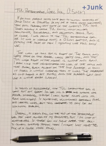
This is the fifth part in a series in which I’m learning to use fountain pens. For the previous installments, click here.


img_4874

Chalk it up to a bad experience, but I really had no desire to pick up a new fountain pen after putting down my Lamy Safari a few months ago. I’d already purchased a pen – a TWSBI Eco – but I couldn’t bring myself to ink it up. So I decided to let it sit, shrink-wrapped on my desk, for about a month. When curiosity finally drove me to break open the packaging, I realized pretty quickly that my experience with fountain pens was about to change for the better.

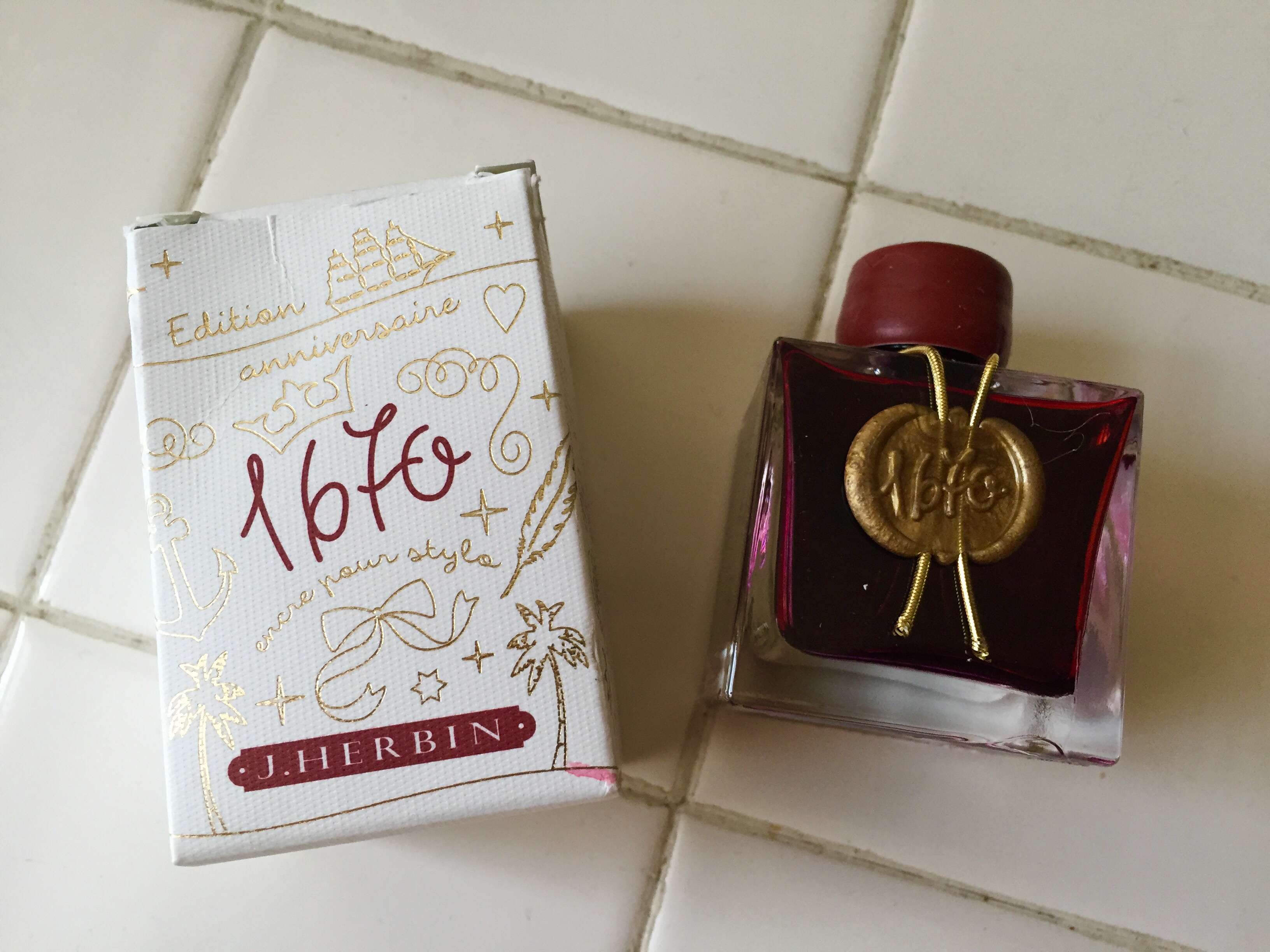
Just to look at it, it’s obvious that the Eco is one of the coolest pens I own. In the lingo of the fountain pen world, it’s referred to as a demonstrator pen, a style that indicates a clear-bodied pen that makes all the inner workings visible. Filled with a dark red ink, “Rouge Hematite” by J. Herbin, it’s neat to watch the fluid slosh around the pen’s innards and move through the feed toward the nib. It’s certainly eye-catching. In fact, a co-worker of mine recently mistook the Eco for an e-cigarette and erroneously scolded me for picking up the habit of smoking.

img_4879

In addition to its looks, I’m very happy with the way the Eco writes. Various nib styles are available, but I decided to blindly go with a stub nib. Luckily, this turned out to be a great choice, as it seems to give a professionally stylized character to my print handwriting. This has everything to do with the shape of the nib, which looks to my eye like a narrower, rounded-off italic nib. This gives it a vertical/horizontal line variation that is a lot more subtle than what you get from a calligraphy pen.

It’s worth noting, too, that the Eco’s piston filling mechanism holds a lot of ink. A piston mechanism, I’ve learned, works almost exactly like a cartridge converter; simply dip the nib into a bottle of ink, then twist the end to suck the ink up into the reservoir. There’s really only one difference between the two filling systems: instead of the a cartridge being housed inside the pen, the pen’s barrel is the ink cartridge. Yes, I have some anxiety about the pen coming apart and ink spilling everywhere, but it’s something which – knock on wood – hasn’t happened yet.

I’m happy to report that the Eco is the first fountain pen I’ve found myself coming back to again and again. I’ve even considered buying a second one with black trim that I’d fill with a black ink to match, but that’s a little ways down the road. For now, I’m excited again about trying another new fountain pen.

In other news…

Shortly after writing about the Zebra V-301, the fountain pen that barely worked, I received an email from one of Zebra’s product managers. The V-301’s design was in the process of being updated, and I was asked if Zebra could send me one to try out. I agreed, and a few months later, the new V-301 arrived in my mailbox.

img_4882

On first inspection, the new V-301 looks practically identical to the older model. Take off the cap, however, and it’s easy to tell that the nib has gone through a bit of an update. A shroud now covers the nib and feed section, and it’s likely that there are more changes underneath. Whatever the case, I can say that the V-301 now works a lot better. The new model writes much more consistently (and right side-up), and the ink flow has been reduced. I’ve also noticed that the cap of the new model posts a lot more securely than the old one did.

It’s still not a particularly smooth fountain pen, and I think the clip could use some beefing up. But for a fountain pen under $5, it’s not bad. At the very least, I’m happy that Zebra listened to their customers and made improvements.