Colors Review: Pilot G-2 Metallics (Green and Purple)

IMG_3220

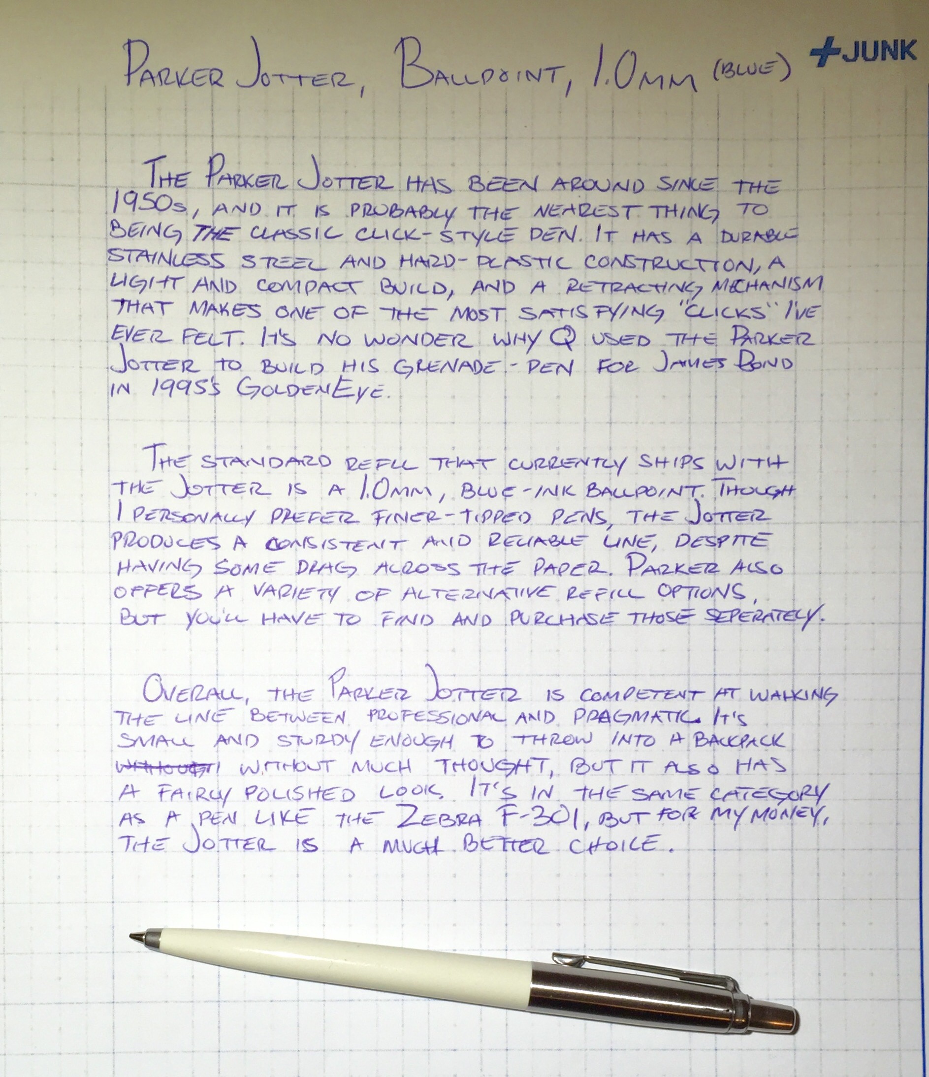
I wasn’t expecting to review another set of Pilot G-2 Metallics so soon, but I liked the blue/silver pack and the pink/gold pack enough that I knew I had to grab this green and purple set when I saw it on the store shelf. Like the other Metallics colors, it uses the Pilot G-2 design, but has an ink infused with some sort of magical metallic pigment. This gives it a sheen that makes it pop out more than a traditional gel ink color.

IMG_3221

While both the green and the purple have that characteristic metallic shine, neither seems to stand out quite like the other colors I’ve tried. The purple also turned out to be a darker than I expected, which almost makes it better for writing than for drawing. However, it’s worth mentioning that all of these metallic colors seem to smear fairly heavily.

Overall, the green and purple colors are good additions to the G-2 Metallics line, but they are probably my least favorite of the bunch. Regardless, I’m happy to see Pilot adding more colors (and I’m still hoping to see a metallic dark red).

IMG_3216

This Doodle inspired by Rich Davis

Book Review: A Drive into the Gap by Kevin Guilfoile

Although Field Notes is primarily known for their pocket-sized notebooks, in the summer of 2012 they branched out into the business of book publishing. The first (and so far only) book printed under the Field Notes brand, A Drive Into the Gap by Kevin Guilfoile, was released alongside their limited Day Game edition of Field Notes notebooks. And while the notebooks have long since sold out, I quickly scooped up a copy of the book when I saw that it remains available on the Field Notes website.

IMG_3139

A Drive into the Gap is a short memoir of Guilfoile’s father, who spent his career in baseball, first as a public relations director for the Pittsburgh Pirates then as a director for the Baseball Hall of Fame. Now, later in life, his father has developed Alzheimer’s disease, and Drive seems to be Guilfoile’s attempt to recapture a piece of what the disease has taken away.

A Drive into the Gap is a very sentimental and well written book. In essence, it’s a story about stories – baseball stories, specifically. Guilfoile’s father loved telling them, often with entertaining embellishments. And at only 71 pages, it’s hard for me to say too much more without spoiling the whole thing.  Luckily, it’s the type of book that can be read in an afternoon, and I enjoyed it immensely, even though I don’t follow much baseball.

IMG_3122
Mine came signed!
As I’m writing, it’s been over 3 years since Field Notes released A Drive into the Gap, and it remains the only book they have published. I contacted Field Notes to ask whether they had plans for any other books. Unfortunately, I only got the vague response that nothing is currently in the works, but they aren’t ruling out the possibility of publishing something in the future.  After reading this book, I sure hope they do.

Review: Monami Plus Pen 3000, Porous Point, Fine

IMG_3146

I generally like writing with porous-point pens, and the Monami Plus Pen 3000 is no exception. And while their slogan – “touch of humanity” – is a bit confusing, the pen draws a good, clean line. However, that isn’t to say that the Plus Pen 3000 is without flaws; it certainly has a few.

IMG_3134

To start, the body of the Plus Pen 3000 is very cheaply made. It’s composed of a thin, black plastic that flexes and bends. It has no grip, and it’s not particularly comfortable to write with. It also has a very short cap with no clip. So basically, it’s not the type of pen you’d want banging around in your bag or backpack, or else the cap might easily be knocked off and ink-stain everything you own.

Still, as a porous-point pen, it creates very neat lettering when writing. The ink has a moderate amount of smear, and I wouldn’t want to rely on it in a pinch. But a dozen of these in a pen cup would work fine – just call it the poor man’s Sharpie Pen.

IMG_3145

Extra Links

Review: Parker Jotter, Ballpoint Pen, 1.0mm (blue ink)

IMG_3201

The Parker Jotter has been around since the 1950s, and it is probably the nearest thing to being the classic click-style pen. It has a durable stainless steel and hard-plastic construction, a light and compact build, and a retracting mechanism that makes one of the most satisfying “clicks” I’ve ever felt. It’s no wonder why Q used the Parker Jotter to build his grenade-pen for James Bond in 1995’s GoldenEye.

IMG_3200

The standard refill that currently ships with the Jotter is a 1.0mm, blue-ink ballpoint. Though I personally prefer finer-tipped pens, the Jotter produces a consistent and reliable line, despite having some drag across the paper. Parker also offers a variety of alternative refill options, but you’ll have to find and purchase those separately.

Overall, the Parker Jotter is competent at walking the line between the professional and the pragmatic. It’s small and sturdy enough to throw in a backpack without much thought, but it also has a fairly polished look. It’s in the same category as a pen like the Zebra F-301, but for my money, the Jotter is a much better choice.

IMG_3199

Extra Links

Review: Zebra 301A, Ballpoint, 0.7mm

IMG_3132

There isn’t much I can say about the Zebra 301A that I havent already said about the Zebra F-301. The only difference between the two is that the 301A has an aluminum barrel in place of the F-301’s stainless steel barrel. Other than that, the grip, the ink refill, the clip, and the retracting mechanism are all exactly the same.

I had expected aluminum to make for a lighter pen, but the weight seems to be about even with the stainless steel F-301. And while the 301A barrel is ever-so-slightly thicker (which makes it ever-so-slightly more comfortable to hold), it’s hardly a noteworthy difference. Neither pen offers a particularly comfortable writing experience.

IMG_3133

On the bright side, the 301A comes in four decorative barrel colors not available for the F-301: blue, maroon, grey, and gold. The maroon, in particular, looks great, and for this reason alone, I’d be more likely to grab a 301A if it were sitting side-by-side with an F-301. Still, I wouldn’t go out of my way for either pen, but if you’re already a fan of the F-301, it might be worth your while to check out the Zebra 301A.

IMG_3131

Extra Links