Review: Pentel Energel Alloy RT, Gel Ink, 0.7mm

IMG_3313

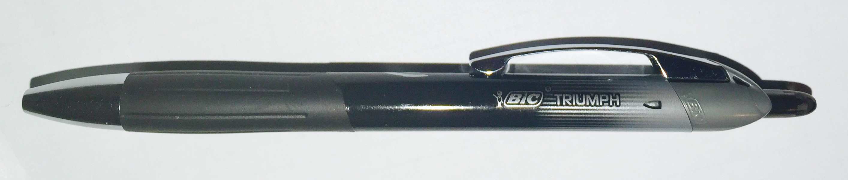
The Pentel Energel Alloy RT is meant to be the “durable” version of the Energel Deluxe RTX. The design of the two pens is nearly identical. They share length, width, and general aesthetic features, with the only major difference being that the body of the Alloy RT is entirely made of aluminum (hence its name). In any other pen I might consider this a lazy cash grab – “let’s cast the pen in aluminum and charge five times the price!” – but the Energel refill is so good that I think the Energel Alloy RT might actually be a bargain.

IMG_3314

Aside from some rattling in the tip, the Energel Alloy RT feels like a high quality pen. It’s nicely balanced, has a sturdy “click” mechanism, and given that there’s no padding on the grip section, manages to be fairly comfortable. If Pentel removed all its branding, I’m convinced they could sell this pen at a specialty shop for 20 dollars or more. As is, however, it’s easy to find the Alloy RT for 10 dollars or less.

For fans of the Energel Deluxe RTX (or just the dark, smooth ink in its refill), the Alloy RT is a great pen to have. For those frugal enough, it might be possible to save money by simply refilling the Alloy RT (rather than buying a box of Deluxe RTX pens for 20 dollars or more). But personally, I like the Alloy RT because it feels like a high-quality pen, and it uses a great refill.

IMG_3312

Extra Links

  • Review at No Pen Intended. Overall it seems to be very positive review, though it sounds like she had some minor smudging issues. Despite the awesomeness of the Energel refill, I did notice that the 0.7mm version (that comes with this pen) tends to smear. I plan on replacing it with the 0.3mm version, which barely smeared at all.
  • Review at Pen Addict. He had issues with the tip of the pen rattling. I noticed this too, depending on the angle I was writing, but it didn’t give me much trouble.
  • Review at Gentlemen Stationer. Boy, that chrome version looks nice. I believe they also come in blue, pink, and gold options.

Review: BIC Triumph 537RT, Gel Ink, 0.5mm

IMG_3205

When I first saw the BIC Triumph 537RT, I assumed that BIC just took its Triumph 537R pen, added a retracting mechanism, tacked a “T” onto the end of the name, and called it a day. After all, it would have still been an improvement because the worst part about the 537R was its cap.

However, when I got my hands on the Triumph 537RT, I realized that not only is it retractable, but BIC also added a grip, removed a bit of the dull gray color, and replaced the rollerball ink with gel ink. It’s practically a different pen altogether, and, luckily, all these changes make it much better.

IMG_3206

That isn’t to say the Triumph 537RT is a great pen – all said and done, it’s an average gel ink pen. It has a satisfyingly dark ink and it writes reliably, but it also smears fairly easily. It’s adequately comfortable with a sturdy clip, but the remaining gray on the plastic barrel still looks a little cheap. It’s not the worst gel ink pen on my desk, but it’s not the best either. At least BIC is heading in the right direction.

IMG_3204

Colors Review: Pilot G-2 Metallics (Green and Purple)

IMG_3220

I wasn’t expecting to review another set of Pilot G-2 Metallics so soon, but I liked the blue/silver pack and the pink/gold pack enough that I knew I had to grab this green and purple set when I saw it on the store shelf. Like the other Metallics colors, it uses the Pilot G-2 design, but has an ink infused with some sort of magical metallic pigment. This gives it a sheen that makes it pop out more than a traditional gel ink color.

IMG_3221

While both the green and the purple have that characteristic metallic shine, neither seems to stand out quite like the other colors I’ve tried. The purple also turned out to be a darker than I expected, which almost makes it better for writing than for drawing. However, it’s worth mentioning that all of these metallic colors seem to smear fairly heavily.

Overall, the green and purple colors are good additions to the G-2 Metallics line, but they are probably my least favorite of the bunch. Regardless, I’m happy to see Pilot adding more colors (and I’m still hoping to see a metallic dark red).

IMG_3216

This Doodle inspired by Rich Davis

Review: Parker Jotter, Ballpoint Pen, 1.0mm (blue ink)

IMG_3201

The Parker Jotter has been around since the 1950s, and it is probably the nearest thing to being the classic click-style pen. It has a durable stainless steel and hard-plastic construction, a light and compact build, and a retracting mechanism that makes one of the most satisfying “clicks” I’ve ever felt. It’s no wonder why Q used the Parker Jotter to build his grenade-pen for James Bond in 1995’s GoldenEye.

IMG_3200

The standard refill that currently ships with the Jotter is a 1.0mm, blue-ink ballpoint. Though I personally prefer finer-tipped pens, the Jotter produces a consistent and reliable line, despite having some drag across the paper. Parker also offers a variety of alternative refill options, but you’ll have to find and purchase those separately.

Overall, the Parker Jotter is competent at walking the line between the professional and the pragmatic. It’s small and sturdy enough to throw in a backpack without much thought, but it also has a fairly polished look. It’s in the same category as a pen like the Zebra F-301, but for my money, the Jotter is a much better choice.

IMG_3199

Extra Links

Review: Zebra 301A, Ballpoint, 0.7mm

IMG_3132

There isn’t much I can say about the Zebra 301A that I havent already said about the Zebra F-301. The only difference between the two is that the 301A has an aluminum barrel in place of the F-301’s stainless steel barrel. Other than that, the grip, the ink refill, the clip, and the retracting mechanism are all exactly the same.

I had expected aluminum to make for a lighter pen, but the weight seems to be about even with the stainless steel F-301. And while the 301A barrel is ever-so-slightly thicker (which makes it ever-so-slightly more comfortable to hold), it’s hardly a noteworthy difference. Neither pen offers a particularly comfortable writing experience.

IMG_3133

On the bright side, the 301A comes in four decorative barrel colors not available for the F-301: blue, maroon, grey, and gold. The maroon, in particular, looks great, and for this reason alone, I’d be more likely to grab a 301A if it were sitting side-by-side with an F-301. Still, I wouldn’t go out of my way for either pen, but if you’re already a fan of the F-301, it might be worth your while to check out the Zebra 301A.

IMG_3131

Extra Links