Off Topic: Oreo Flavor Obsession

Since 1912, when the Oreo was first introduced, Nabisco had been content with their cookie’s traditional flavor: a vanilla frosting sandwiched between two chocolate wafers. Of course, the company fiddled with the recipe over the years. Ingredients like trans fats and lard were removed or replaced, the filling was occasionally dyed into fun colors, and the cookies were both shrunken and enlarged to create different product lines.

Nabisco even sporadically produced new flavor varieties like lemon, mint, and peanut butter. But that was nothing compared to the flavor explosion that occurred in the 2010s, right around the time Mondelez took over as the brand’s parent company. At some point, the shackles were loosened on the Oreo R&D department, and the whole brand went berserk.

Oreo flavors like birthday cake and red velvet, novelties a few years ago, have become standard, and they’re now are available on store shelves year-round. The newer flavors these days are released in “limited edition” runs, which come and go after couple of months. These limited editions are usually where Oreo releases the really weird flavors, like “waffles & syrup” or “cherry cola.”

The Oreo is the most popular cookie in the world with billions in sales every year, making three times more money than it’s nearest competitor. It seems risky for a big company to mess around with such a successful formula. So why do it?

I tried to contact Oreo for an explanation, but (not surprisingly) they didn’t respond. But, having consumed my fair share of Oreo flavors, I suspect that their strategy is three-fold:

  1. Get some media attention. Oreo is an old cookie, but some of these new flavors can get some buzz. When they release particularly odd flavors (like Watermelon or Kettle Corn), they seem to get a lot of it.
  2. Capitalize on seasonal trends. Apparently, pumpkin spice products do hundreds of millions of dollars in sales each year, so it’s not surprising that Oreo jumped on that bandwagon. But that’s not all, they release new Oreo flavors to coincide with many holidays: Peppermint Bark for Christmas, Peeps during Easter, Hot & Spicy Cinnamon around Valentine’s Day, etc.
  3. Market test new ideas. I suspect that the tamer flavors, like coconut or dark chocolate, are really just broad market tests. Ditto for brand mash-ups like Reese’s Peanut Butter Cup and Dunkin’ Donuts Mocha Oreos. Mondelez is probably fishing for a new hit flavor, hoping to create the next Doritos Locos Taco.

But whatever the case, this “new flavor” strategy must be working because they don’t seem to be slowing down. For myself, I can say that I’ll grab a new flavor of Oreo every time I see one, and I probably wouldn’t buy Oreos otherwise.

I can’t explain why I like trying these new Oreo flavors. They’re rarely as good as the original cookie, and sometimes they are far worse (I’m looking at you Swedish Fish Oreo) But it’s still a lot of fun to try them all.

For the last few years, I’ve even been documenting these new flavors on Twitter (and I’ve compiled them into a list here). I’ve tried dozens of them already, and I’m still interested to see what comes next. Eventually, these flavors will start to get predictable and boring. Oreo’s flavor obsession will die, as will my interest to try them. But, for the time being, the Oreo R&D department still seems able to come up with weird and creative ideas. So, even though I probably don’t need the extra calories, I hope Oreo keeps it up.

Notes on MxLxBxD Field Notes

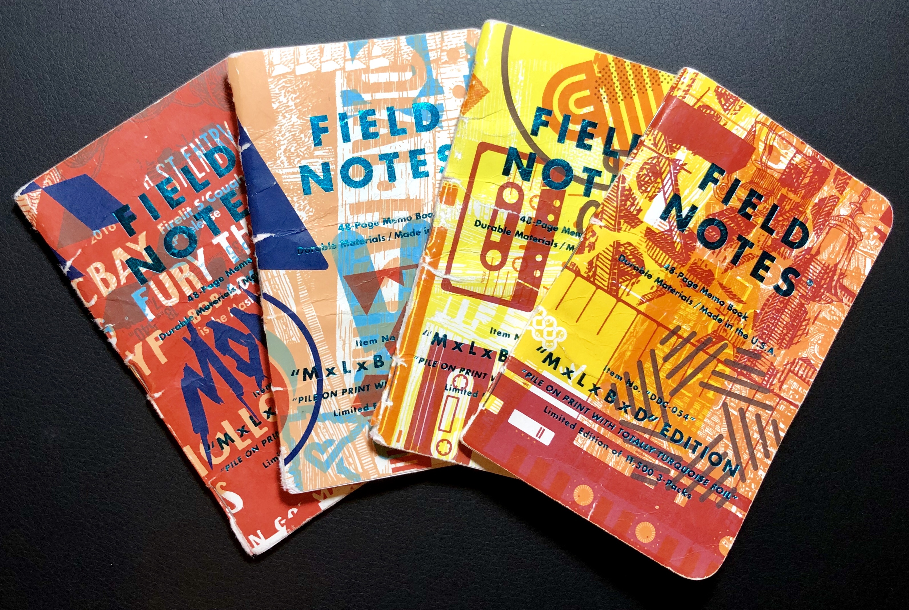
When the Dead Prints Edition Field Notes were released in 2015, they were an immediate hit. They were so popular and so sought-after that there was bound to be a follow-up edition, and that’s exactly what happened in February 2018. Mondo, Landland, and Draplin Design Co. got together again, this time inviting Burlesque of North America along for the ride, to create the MxLxBxD Edition Field Notes.

Although Dead Prints Field Notes were created from each company’s leftover scraps, which made for designs that varied wildly depending on where you bought them, the MxLxBxD Field Notes was more of a group effort to create a single product. According to the Field Notes website, the image files for the cover design were passed from company to company (a total of 84 times) with new elements being continually added. The end result is a bunch of notebooks that look like a heavily graffitied wall.

Other specs of note: the Field Notes logo (and all the cover text) are printed with turquoise foil press, and the notebooks are the standard 5.5” x 3.5” pocked size. Inside, you get turquoise grid ruling on 50# white paper. A total of 11,500 3-packs were made (as apposed to the measly 3,000 made for the Dead Prints edition), and some are still available. As of this writing, you can purchase them directly from here, here and here.

Though these books aren’t as unique as the Dead Prints Edition, I like their loud and creative look. If you use Field Notes and are a fan of one or more of these companies, it’s worth grabbing a pack or two as long as they’re still available. But, of course, if these companies ever team up again, I’m sure whatever they come up with will be just as cool.

Additional Notes

  • Of the 30 “Practical Applications” listed in the notebooks’ inside-back cover, my favorites are the following: “01. Hot Dog Stands To Avoid”; “16. Weekly Cheese Tally”; and “26. Ink-Mixing Ratios.”
  • For more info and good pictures, check out the write-up on the MxLxBxD Edition at Three Staples.
  • If you like these, they remind me a lot of the Two Rivers Edition. Though, those aren’t so easy to get hold of these days.

Review: IKEA Fullfölja, Gel Ink Pen

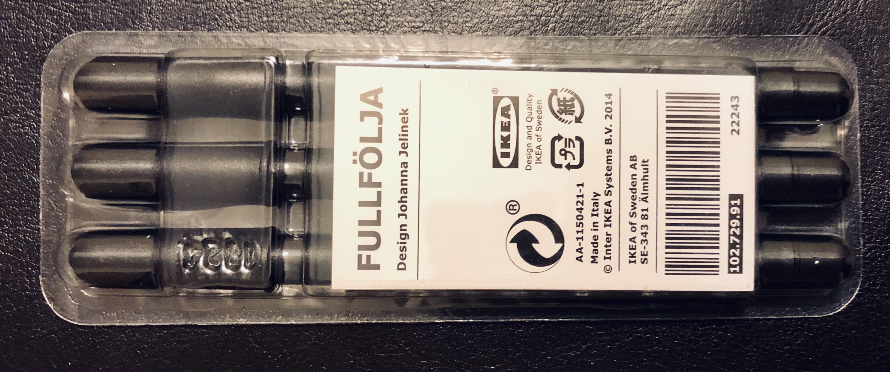
Shopping at IKEA can actually be pretty fun. The size and layout of these stores essentially make it a day trip; one full of poor attempts to pronounce Swedish words, small arguments about kitchen decor, and tasty meatball lunches. As I cut through the stationery department on my most recent visit, I found stacks of gel pens with the name Fullfölja – I told you that this stuff is hard to pronounce – and grabbed a 3-pack without hesitation because, well, why not? Impulse buying is an IKEA staple.

As you’d expect from an IKEA design, the pen is simple and straightforward. It’s about 5.5-inches long with an all-black, rounded barrel and a short cap. There is no clip, and the pen is not refillable. For the tip, I couldn’t find any sizing information, but the pen produces a fairly thick line. So I’d wager that the tip size is about 1.0mm. With such a thick line, the ink does smear easily, but it also produces a satisfyingly dark, black ink.

I’ll admit that there’s no shortage of gel pens that, for a similar price, are better than the Fullfölja , but strangely, I like these pens a lot. The design of the pen captures the IKEA brand so perfectly that using one gives me a small hit of the fun/stressful rush you get while shopping at an IKEA. They remind me of the Baron Fig Squire, albeit a plastic version, which I don’t really mind losing if it happens to roll off my table at a coffee shop.

I’m certainly not going to encourage anybody to go out of their way to find these pens, and the prices I’ve found online are ridiculous. But if you happen across these during your next IKEA visit, you might as well toss a 3-pack in your bag for $2.50. I think they’re worth it.

Retro Talk: Yoshimi & The Pink Robots

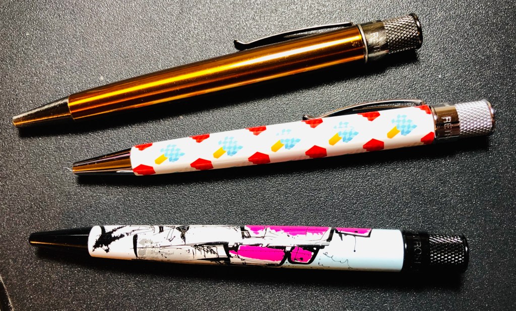
Retro 1951 and Brad Dowdy (of The Pen Addict) have come together twice before to produce really nice designs for the Tornado, which is one of my favorite rollerball pens. But this latest collaboration, The Pink Robots Tornado, may be evidence in favor of the old saying, “the third time’s the charm.”

I’ll leave it to Dowdy to tell the story behind the pen — he wrote a great post in which he explains it all. But, in short, the design that wraps around the barrel is an illustration created by Matthew Morse, which is an homage to Yoshimi Battles the Pink Robots, the song and album by The Flaming Lips. If you haven’t heard it, I encourage you to check it out. It’s good!

Morse’s design for the pen wrap is similar to the original Flaming Lips album cover, albeit in a totally different style. It depicts a young Japanese Girl, Yoshimi, wielding a long, pink sword, ready to do battle with a couple of giant pink robots. The twist, clip, and tip of the pen are a all black, and, on the disk inset at the top of the twist, the “pen addict” logo is centered inside a hot pink background.

In my opinion, the best Tornado designs are the ones that adapt the work of artists, like the Bioworkz Edition and the Joey Feldman Edition, or the ones that tell a story, like the Tiger Shark or the Albert. This Pink Robots Edition manages to do both, which is probably why I like it so much. The bad news is that there were only 500 of these pens produced (I’ve got #156), and they sold out quickly. But with the success of this pen, there’s sure to be plenty of creative stuff coming next time Dowdy and Retro 1951 team up.

Looking Ahead to 2019

There’s no getting around it: 2018 was a hard year, a busy year, and also an exciting year in many ways. On the positive side, I finally managed to finish writing my Nib Novice series. I visited New York City and picked up some stuff from a few cool stationery stores (and also ran the NYC Marathon). I even fixed all my misspellings of “stationery” on this blog.

But, still, I only managed 16 new posts/reviews, which resulted in an 18% decline in pageviews compared to 2017. The most popular post of the year was my review of the Jeffbona In[k]ception pen, but my 2018 pen of the year is probably pretty obvious; the Pilot Vanishing Point. Despite some issues I’ve had with it, it’s a really cool fountain pen that I’ve frequently come back to.

Pilot Vanishing Point

So what’s in store for 2019? As I mentioned last year, I don’t do resolutions very well. So, instead, here are five goals I have for this website:

  1. More book reviews. I didn’t manage to write any of these in 2018, but I found a couple of books on The Well-Appointed Desk’s Gift Guide that sound pretty interesting.
  2. I still use Field Notes pocket notebooks all the time, but I just haven’t had time to write reviews for the many new editions that have been released. That will have to change in 2019.
  3. I’d like to write at least a couple more Off-Topic posts this year.
  4. I need to update my “Five Pens to Try” post. Though I don’t think much will change, it’s been a while since it’s been refreshed.
  5. Finally, I’d like to reverse trends and post a moderate increase in pageviews this year. Assuming I hit the above goals, this should take care of itself.

And, as always, there’s a lot to look forward to outside of the pen world. I’m excited about Avengers Endgame, as well as the finale of Game of Thrones (though I’m pretty sure that the book series will never be finished). I’ll also be running the 2019 Chicago Marathon, and (last but not least) by the end of the year I’ll be married!

So, to everyone reading this, I hope you have a happy, safe, and fun 2019!