Retro Talk: The Terabyte Tornado

img_3963

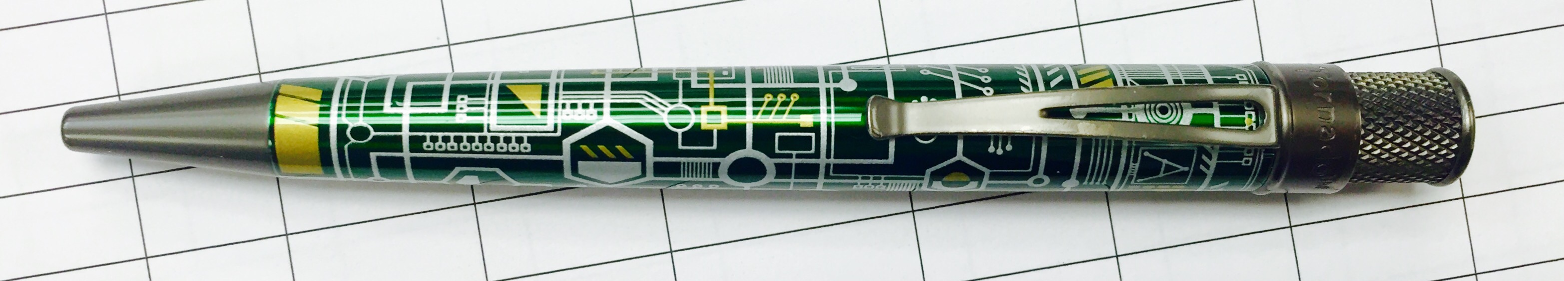
From time to time, Retro 51 announces new editions to its popular line of Tornado pens. They are always fun to see, but I’m not usually excited enough to drop the $20 to $40 they typically cost.  That was not the case, however, when I saw the Terabyte Tornado announced last year, which I pre-ordered without hesitation. It arrived last December, and it’s been a regular in my pen rotation since.

Limited to 500 pieces and sold only through Anderson Pens, the Terabyte Tornado is wrapped with a circuit-board design, and its metallic bits – the tip, clip, and twist – are given a dark, matted finish that is reminiscent of solder alloy. There’s also a dark green disk inset into the top of the twist, which adds a nice accent. Careful, though – after accidentally dropping the pen, the disk popped right out (but a little Krazy glue quickly fixed it).

TerabyteTornado_disk

I really like the design, but I think an actual circuit-board pattern (or perhaps texture) would have really knocked this one out of the park. For example, I really love what Retro 51 did with the Albert, which is wrapped in a design that’s an accurate proof for Einstein’s famous E=MC² equation. Instead, the Terabyte’s design is an artistic rendering of a circuit board. It looks cool to me, but a hardcore computer enthusiast might disagree.

Other than that, the Terabyte Tornado is your standard Retro 51 fare. If the design appeals to you, you might want to pick it up soon. These things tend to sell out. Otherwise, there will be plenty more designs to come in the future, and I’m sure I’ll be adding at least a few of them to my Retro 51 collection.

img_3979


Review: Pilot G-2 Pro, Gel Ink, 0.7mm

img_3971

The Pilot G-2 is such a ubiquitous and popular pen, it’s really no surprise that Pilot has attempted to build on the brand by creating this “upgraded” version, the Pilot G-2 Pro. The G-2 Pro is little beefier: it’s slightly thicker, slightly heavier, and has a larger “clicker.” It’s a nice pen, but at double the price of the standard G-2, it’s hard to find a compelling reason to spend the extra money.

img_3972

When it comes right down to it, the G-2 Pro is mostly an aesthetic upgrade. Instead of the cheap, clear plastic of the original, the G-2 Pro comes with a painted barrel. Four color options are available – gray, dark blue, olive green, and maroon. The upgraded design even includes a faux-metal trim. But don’t be fooled; the body is still entirely made of plastic.

For an upgrade like this to make sense, it should give die-hard G-2 users something worthwhile. For example, Pentel produced the Energel Alloy RT, a durable, aluminum version of the popular Energel Deluxe RTX. The G-2 Pro, on the other hand, is more of a paint job. So, unless you’re really itching for a prettier G-2, it’s hard to justify purchasing the G-2 Pro.

img_3968

Review: Baoke Simple, Gel Ink, 0.5mm

img_3959

For the Baoke Simple, there really is no more appropriate name. It’s a 0.5mm gel pen with a frosted, plastic barrel and a cheap clip. The refill is nothing special, though it writes reliably enough. The cap secures and posts snugly, and there’s no padded grip to speak of. Overall, the Simple is one of the more basic gel pens I’ve used, yet, surprisingly, I’ve found myself really liking it.

img_3960

When you purchase a cheap pen, you’ll usually get something with a thin barrel made out of a hard plastic, a design that becomes uncomfortable when writing for an extended period. The Baoke Simple, on the other hand, has a thicker barrel made with a softer plastic. This makes for a much more comfortable writing experience, and I wish more pen manufactures would follow suit.

Unfortunately, Baoke is a Chinese stationery manufacturer whose pens aren’t commonly sold in the United States. It’s possible to find the Simple online for about 40 cents per pen, which may not be worth the effort. But regardless, I’m impressed that Baoke has a managed to make a good pen out of a cheap, no-frills design. Perhaps something similar will eventually make its way to store shelves in the West.

img_3958

Review: Pilot Down Force, Pressurized Ballpoint, 0.7mm

img_3955

When I think of pressurized ballpoint pens, I tend to think of something small and durable, like the Fisher Cap-O-Matic Space Pen or the Tombow Airpress. These pens are meant to slip easily into a pocket or get banged around in a backpack, ready to write on a dirty slip of paper held up against an airplane window, if need be. Meanwhile, the Pilot Down Force is like the awkward cousin of the pressurized pen category. It’s bigger, clunkier, and it has a clip that juts out a little too far.

Regardless, the Down Force writes just as well as these other pens. Its thick barrel and knurled, plastic grip make it a comfortable writer, and the pressurized ink works at any angle and on most surfaces. The Down Force also has a convenient spring-loaded clip, which ties in with a very unique retracting mechanism.

DownForceRetract

Like most retractable pens, pressing the plunger down will eject the pen’s tip, but it only retracts when opening the clip. It’s a feature that’s meant to prevent ink stains on shirts and pants, since it’s impossible to clip the pen to anything with its tip exposed. I like this feature – it reminds me of a low-cost version of the Lamy Dialog 2 – but it definitely takes a little getting used to.

The Down Force is one of the less expensive pressurized ballpoints on the market, and it comes in an array of neat colors that add a fun personal flair – I went with the orange. In the end you get a good pen, just not one that’s as pocket-friendly or durable as others in its category. I like it, but I don’t think it will ever replace my space pen.

img_3956

Extra Links

Nib Novice, Part 3 – The Sheaffer Calligrapher

Note: this post is the third part of a series in which I’m learning about fountain pens. For Part 1, click here. For part 2, click here.

img_3949

One bonus that comes from having a blog about pens is that I occasionally get some interesting hand-me-downs. This Sheaffer Caligrapher is a good example. Purchased sometime in the 1980s, it was found by my mom at the bottom of her desk drawer, where it sat in its original packaging, unopened and with two black-ink cartridges.

After my bad experience with the Zebra V-301, I was eager to break open the packaging of a new fountain pen and pop one of the ink cartridges in. I gave the cartridge a squeeze to get the ink flowing, and to my surprise, this 30-year-old pen began to write without any issues (though I did manage to make a small mess).

img_3951
italic (calligraphy) nib vs. fine nib

Up until now, I haven’t gotten into much detail about nibs. The nib is the tip of the fountain pen; the part the touches the paper and distributes ink to the page. There are a lot of different nib styles – fine point, medium point, stub, flex, etc. And a fountain pen will produce different line variations, depending on the type of nib being used.

The Shaffer Calligrapher uses an italic nib, which has a tip that flattens out into a broad area. Rather than providing a consistent line width, this nib design is meant to produce broad horizontal lines and thin vertical lines. And If you hadn’t guessed by this pen’s name, it makes an ideal tool for calligraphy.

img_3948

As far as I can tell, the Sheaffer Calligrapher is an older model of the Sheaffer Viewpoint, which sells for under $10 and is commonly bundled with special calligraphy sets. The Calligrapher is built nicely for this purpose, too. It has a threaded cap with a flat end that can stand up vertically when posted, making it ideal for longer writing sessions. Surprisingly, it’s also a pretty durable pen. I inadvertently threw it in my backpack where it banged around for a week, and when I took it out to write, it still worked great.

All said and done, It was nice to use the Calligrapher. It’s a good-quality pen at a low price, however, I can also tell that it isn’t the right pen for me. I’d like a pen that’s more practical for every day use and something that fits my block writing style better. In the mean time, the Calligrapher will rest in slot number three on my fountain pen stand, waiting until the next time I need to write a thank you note.

img_3950