Notes on Lunacy Field Notes

Lunacy, Field Notes’ Fall 2016 Special Edition, is what you get when you take a simple concept and go a little crazy on the execution.

img_5608

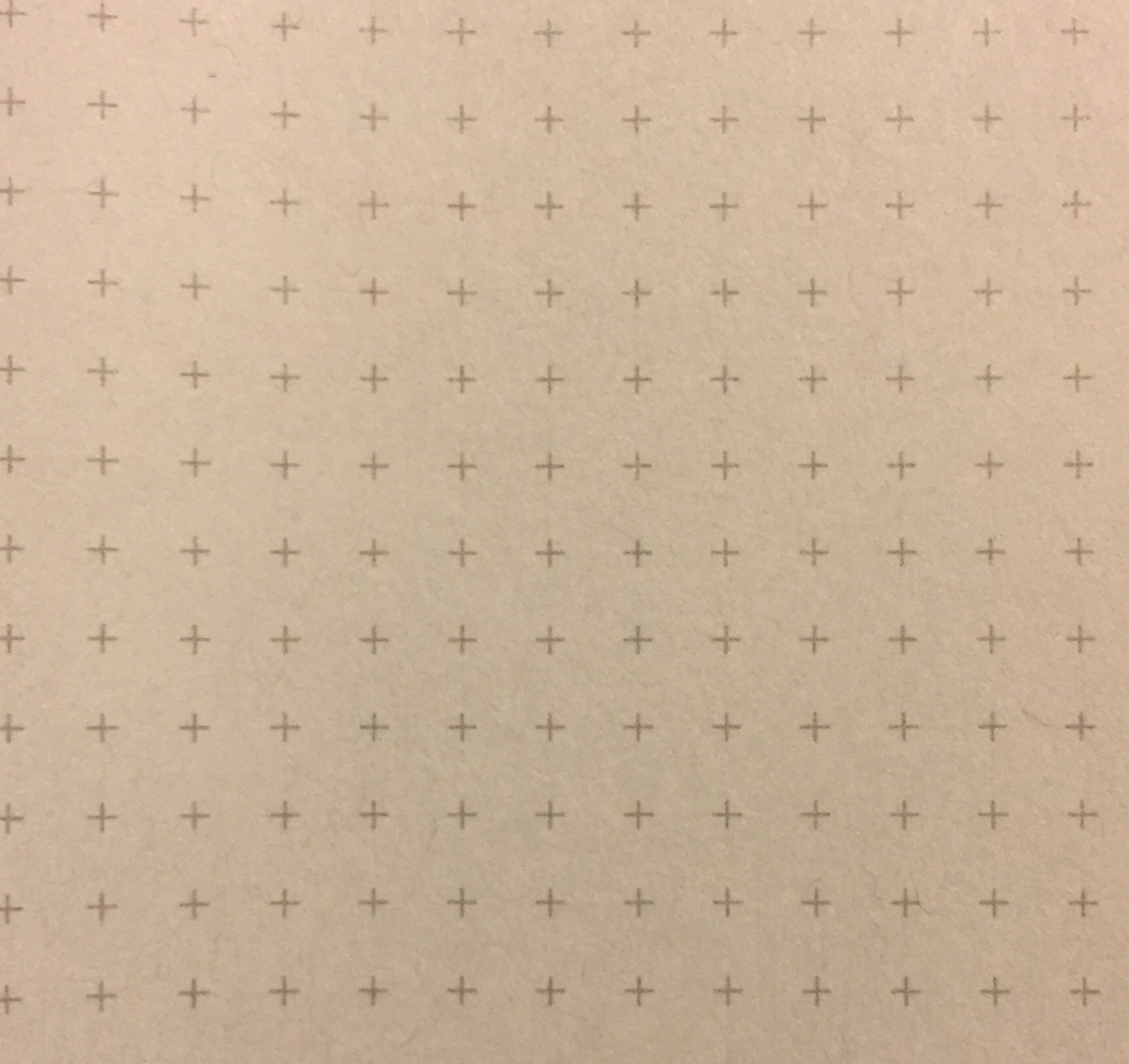
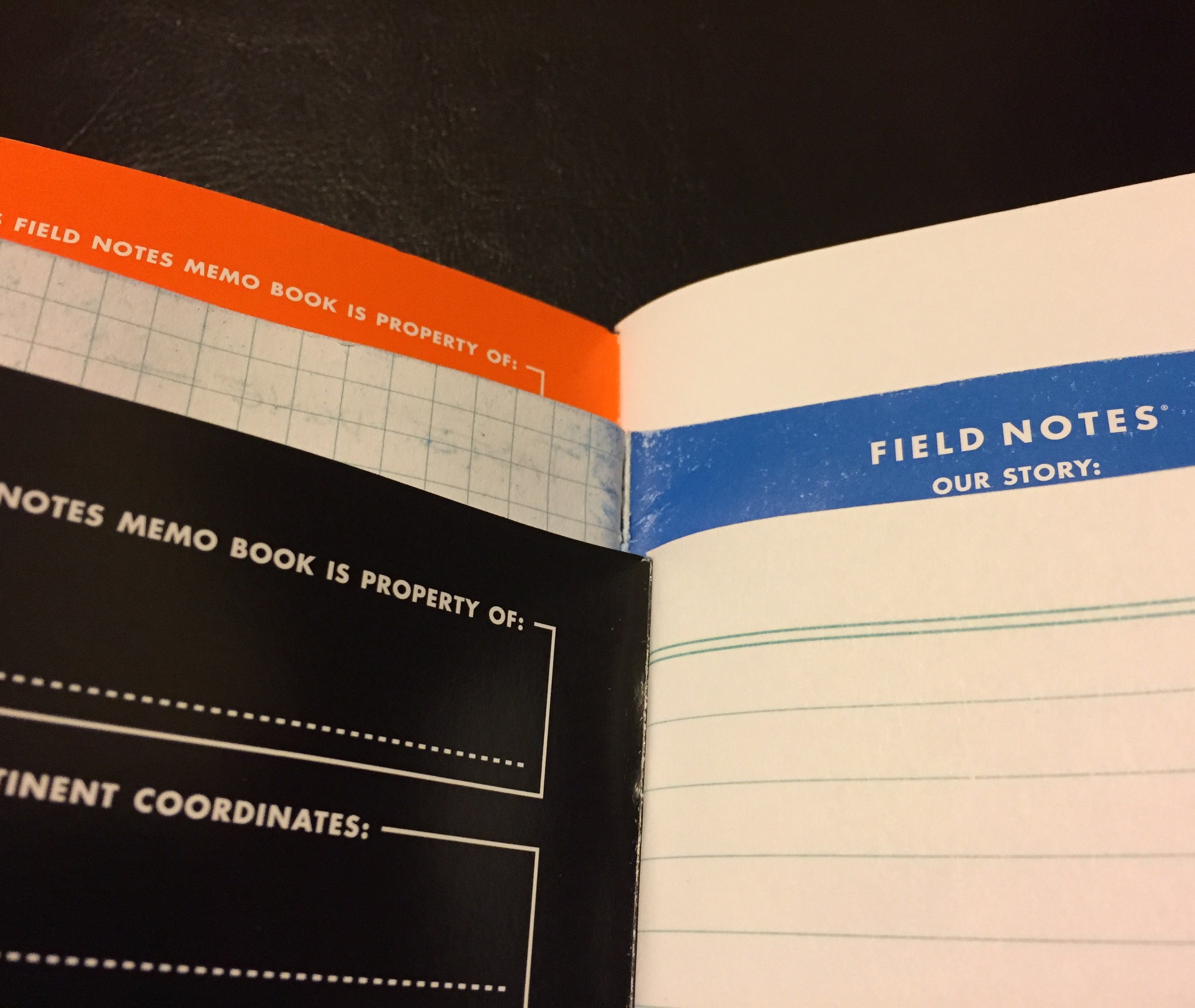
Its theme pays homage to Earth’s celestial buddy, the moon, and there’s a lot more than usual going on with these little 3.5″ x 5.5″ pocket notebooks. They contain 60# light gray notebook paper with a reticle grid ruling. They are bound together with black staples that blend into a shimmery, black cover stock, giving it an almost leather-like look. And along with the the embossed Field Notes logo on the front, you’ll find a black moon logo embossed on the back cover.

But, of course, the most noteworthy aspect of the Lunacy edition is their die-cut covers, which open like little windows into a glossy inner photo of the moon.  Each book in the set is cut to represent a different phase of the moon: there’s a waning crescent, a third-quarter (half) moon, and a full-moon. Those who are subscribers to Field Notes’ quarterly additions also received a bonus “new moon” book, which just has a fully-intact black cover.

img_5893

The glossy inner cover-pages aren’t just for show either, they also include a bunch extra info. In typical Field Notes fashion, some of this information is lightly useful, but most of it is just for fun. Need to know how to say “moon” in German? This notebook has got you covered. Want to know how to kill a werewolf? You’ll have that info in your back pocket too.

It’s a cool edition overall, though I’m not a huge fan of the die-cut covers. While they don’t rip or tear like I initially thought they would, I still find them a little annoying. But beyond that, these books remind me a lot of Field Notes’ Night Sky edition from the summer of 2014. That’s an edition I’ve always wanted to own, but they are now sold out (and much too expensive to buy through eBay). Lunacy, as well, is a little more expensive than usual – $12.95 for a 3-pack – but still worth it for any aspiring astronaut.

img_5894

Additional Notes

  • Of the 30 “Practical Applications” listed in the notebooks’ inside-back cover, my favorites are the following: “2. ‘That’s No Moon'”; “20. Dark Side Theories”; and “22. Tidal Changes.”
  • Check out  Ed Jelly’s review for lots of good pictures, and Fountain Pen Follies says that these notebooks are very fountain pen friendly.
  • Definitely check out the video that Field Notes produced for this edition. It’s almost as if they were trying to fake the moon landing.

Review: BIC Gelocity, Gel Ink, 0.7mm

img_5875

Let’s be real; the BIC Gelocity is pretty much just a re-branding of BIC’s old Velocity Gel pen. However, there are a few differences worth noting. First and foremost, the refill inside the pen seems to have been updated. The ink flow is no longer as inconsistent, and it runs a bit smoother – and wetter – than the old Velocity Gel. But like its predecessor, the Gelocity’s ink still smears quite heavily.

There are also some minor aesthetic updates. The knock has been turned white, the trim is a lighter gray, and the grip is maybe a tiny bit softer. But beyond that, it’s hard to tell the two pens apart.

img_5874

It’s fair to say that it’s an improvement, albeit a minor one, but there’s nothing here that elevates the Gelocity above other mediocre “premium plastic” pens. It’s fine. It’ll do the job. Still, better options are available.

img_5873

Retro Talk: The Birthday Tornado

img_5797

Take a look through any Retro 51 collection, and you’re bound to find a lot of really amazing designs. And though a simple classic lacquer Tornado costs only about $20, you’ll have to shell out around $25 to $50 for a special or limited edition Tornado or sometimes upwards of $100 for a Tornado design that’s discontinued or currently out of production. There is, however, one exception that I know of: the Retro 51 ‘Birthday Greetings’ Tornado series.

At one point in time, Retro 51 was making a bunch of these ‘Greeting Series’ pens. There’s the ‘Happy Holidays’ Tornado, the ‘Congrats’ Tornado, and even the simple ‘Thanks’ Tornado, but these days they are all pretty difficult to find for a reasonable price. But for whatever reason, the ‘Happy Birthday’ Tornado can easily be found for under 15 dollars.

retro-51-birthdayblue

The ‘Birthday Greeting’ series was made with three different colors/designs: blue (shown above), yellow (shown below), and red (shown here). Apart from the colors, the red and yellow pens are identical. They have phrases and icons pictured all over the barrel, and the word “BIRTHDAY!” is splashed across the side. The blue version is subtler, and it mainly consists of numbers/ages. The blue design still contains an assortment of birthday-ish words and icons, but you’d really need to examine it in order to see the theme.

Perhaps it feels like you can only use this pen one day a year, but I actually use mine all the time (I bought the blue version for myself last year). It’s also a nice and easy present. In fact, I just gave away the yellow version as a gift, and I might just stockpile the red version to give away sometime next year. And as an unskilled gift wrapper, I always appreciate when a product comes in its own gift box.

retro51-birthday-yellow

Notes on 2016 Nixon Field Notes

img_4864

Field Notes creates a lot of specially-branded notebooks for outside companies, but they are usually very simple. Often it will just be a standard Kraft book with a company’s logo stamped on the front – sometimes you’ll see embossing or even a neat new color. But ocassionally something very cool and unique is released, such as this recent collaboration with Nixon, the upscale wristwatch company.

This isn’t the first time Field Notes teamed up with Nixon. Last year they made a pretty cool tri-color pack, but they knocked it out of the park this year by using photographs from Jeff Divine for the notebooks’ covers. Divine, who has been a professional surf photographer since the ’60s, took some great beach shots, each with a very distinct style.

img_4867

The 3-pack has mixed ruling, meaning that one notebook has standard ruling, one has grid lines, and one has blank pages. So if you only use one style of ruling, you just have to live with (or give away) the other two. Inside is 60# white paper, and the covers are made with 100# glossy stock, each with a different color on the inner-cover. They are also the standard 3.5″ x 5.5″ pocket-notebook size.

These books are currently still available, but as a limited edition of 5,000, they are likely to run out eventually. However, be prepared to pay a bit more. The Nixon books are $15 per 3-pack instead of the usual $10. Luckily, these notebooks pull double duty: during the upcoming winter, they’ll be a good reminder of the warmer times.

img_5728

Additional Notes

  • Of the 30 “Practical Applications” listed in the notebooks’ inside-back cover, my favorites are the following: “03. Shit My Dad Used to Say”; “08. Taco Joints”; and “19. Best Playlist Ever.”
  • These Nixon books seem very similar to the America the Beautiful edition (from the Spring of 2013). I haven’t gotten my hands on a pack of those yet, but you can see reviews from The Well Appointed Desk, Three Staples, and MbS-P-B.
  • On a side note, Field Notes has released a ton of special/limited editions over the last year. I’m having trouble keeping up, and I think I’m starting to develop “Special Edition Fatigue.”

Book Review: The History and Uncertain Future of Handwriting by Anne Trubek

This may come as a surprise, but a lot of people have strong feelings about handwriting. Ask a few friends, “should children be taught cursive at school?” and you’re bound to receive a variety of vigorous opinions. Anne Trubek, author of The History and Uncertain Future of Handwriting, may have learned this the hard way. In August of this year, just prior to the book’s publication, Trubek penned a New York Times op-ed piece headlined Handwriting Just Doesn’t Matter, and it received over one-hundred comments and letters. Almost all of these reader responses disagreed with Trubek’s call for schools to refocus handwriting education elsewhere, and one reader even went far enough to call keyboards “offensive tools.”

9781620402153

In some ways Trubek’s newly released book is a 154-page extension of that NYT op-ed, but it’s more aptly characterized as a simple history book. While she eventually gets around to discussing the digital age, Trubek fills most of the book’s pages by explaining the cultural evolution of writing, from early cuneiform and hieroglyphics to the common Palmer and D’Nealian cursive fonts that most of us use today. It covers a lot of the same ground as Paper by Mark Kurlansky, though Trubek’s narrower focus makes for a much quicker read.

When Trubek gets around to discussing the future of handwriting near the end of the book, it’s a lot less controversial than I’d expected given much of the ire it has created. Her argument boils down to this: writing’s role is changing in the digital age, as it has throughout history. Just as the printing press reduced the need for scribes, computers reduce our need for handwriting. It’s simply not as critical as it once was, and perhaps the time children spend learning handwriting could be reallocated toward something more useful (like computer skills). I’m unclear whether Trubek’s argument extends to learning basic, legible print handwriting – something which still has a lot of utility – but her main contention seems to be with cursive.

Trubek goes on to discuss the benefits of handwriting that are presented by its advocates, though she largely dismisses them as being cultural arguments. However, the cultural element of cursive is, in my opinion, the best reason for including it in a school curriculum. At least for the time being, cursive is still in use, and everyone would benefit from knowing the script to some extent. Though it should be pointed out that Trubek still envisions a place for cursive, at least as an art form, a hobby, or a tool for developing fine motor skills.

Whether you agree with Trubek’s main argument or not, anybody with a passionate opinion about this topic will be fascinated by the bulk of this book. The history lesson it contains is worthwhile, and the book is short enough to complete within a few sittings. And, who knows, after finishing the book you might be inclined to write the author a handwritten note in response.